TL;DR:
- Professional print output requires color accuracy, sharp resolution, and consistent file structure.
- Following technical standards like 300 DPI, CMYK, and proper file preparation ensures flawless printing results.
- AI tools speed up design creation but still need human review for print-ready adjustments.
Exporting a design and sending it to print are two very different things. Many designers and print shop owners discover this the hard way, after a client calls about washed-out colors, blurry text, or a logo that printed half an inch off-center. The cost of a reprint is real. So is the damage to your reputation. This guide breaks down exactly what professional print output means, the technical standards that define it, and the specific steps you need to take to get flawless results every time. Whether you are working with traditional artwork or AI-generated designs, the principles are the same.
Table of Contents
- Defining professional print output
- Critical standards: Resolution, color, and file formats
- From digital design to print: Avoiding common pitfalls
- AI tools and the evolving print output workflow
- Best practices for consistently flawless print results
- Perspective: Why print output standards are evolving fast
- Discover smarter print file prep solutions
- Frequently asked questions
Key Takeaways
| Point | Details |
|---|---|
| Standardization is key | Following color, resolution, and file specs ensures consistent, professional print results. |
| AI transforms design | AI speeds up ideas, but human checks remain crucial for print success. |
| Avoid common print errors | Manual review and prep catch mistakes before they cost you time or money. |
| Adapting to new tech | Staying aware of evolving standards like ECG keeps print professionals competitive. |
Defining professional print output
Professional print output is not just about a design looking good on screen. It is about producing a physical result that matches the intent of the original design, consistently, across every print run.
A working definition: professional print output delivers the correct colors, sharp detail, and reliable file structure needed to reproduce a design accurately on a substrate. That means the same result on run one and run one thousand.
Here is what separates professional output from an amateur job:
- Color accuracy: Colors match the approved proof, not just what looks right on a monitor
- Image resolution: Artwork is sharp at the final print size, with no pixelation or softness
- File reliability: Files are structured correctly, with proper bleeds, safe zones, and embedded fonts
- Print consistency: Results are repeatable across different machines, operators, and print runs
As the industry puts it, professional print output is defined by consistency, accuracy, and repeatability in color and detail.
The risks of getting this wrong are concrete. Missed deadlines from reprints. Higher material costs. Clients who do not come back. Understanding print file output standards before you start a job is far cheaper than fixing errors after the press runs.
"Maturity in print production means moving from occasional quality to measurable, repeatable results that clients can count on every time." — Printing Industries of America
The bottom line: professional print output is a process, not a lucky outcome.
Critical standards: Resolution, color, and file formats
Now that the concept is clear, it is essential to understand the specific technical standards that determine if your output meets professional expectations.
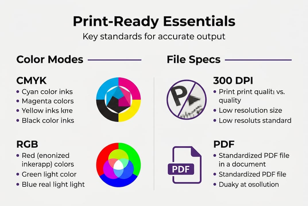
Resolution: DPI vs. PPI
DPI (dots per inch) refers to the physical ink dots a printer places on paper. PPI (pixels per inch) refers to the pixel density of your digital file. For print, 300 DPI is sufficient for most professional jobs, but fine text or luxury packaging may require 600 DPI or more. Always set your file resolution at the final output size, not the screen preview size.
Color spaces
CMYK is the professional standard for print. It maps directly to the four ink channels most presses use. RGB is built for screens and will shift unpredictably when converted at the press. Extended Color Gamut (ECG) is emerging as a powerful option, expanding the printable color range for more vibrant results, but it requires specific press configurations and color profiles. Understanding color accuracy in print before you convert files saves time and money.
File format comparison
| Format | Best use | Pros | Cons |
|---|---|---|---|
| Universal print delivery | Embeds fonts, scalable | Can hide errors if not preflighted | |
| TIFF | High-res raster images | Lossless quality | Large file size |
| EPS | Vector art, logos | Scalable, press-compatible | Older format, limited support |
| AI | Native Adobe Illustrator | Fully editable | Requires Illustrator to open |
Review essential print output specs to confirm your file meets press requirements before submission.
Steps for file export:
- Set document color mode to CMYK before designing
- Confirm resolution at 300 DPI minimum at final print size
- Embed or outline all fonts
- Add 0.125 inch bleed on all sides
- Export as press-quality PDF with crop marks
Pro Tip: Always soft-proof your file using your printer's ICC color profile before sending. This shows you exactly how colors will shift from screen to paper, so there are no surprises at delivery.
From digital design to print: Avoiding common pitfalls
Understanding the standards is half the battle. Translating your digital designs into flawless prints is where most issues arise.
The biggest trap is trusting your monitor. Screens display light. Printers use ink. A vivid blue on your display may print as a dull navy if the color profile is wrong. This disconnect causes more reprints than any other single issue.
Common pitfalls to watch for:
- RGB-to-CMYK conversion errors: Colors shift when converted late in the workflow. Convert early and check the result
- Font problems: Unembedded or missing fonts cause text to reflow or substitute, ruining layouts
- Image compression artifacts: Low-quality JPEGs introduce visible blocks and noise at print size
- Incorrect bleed and trim: Artwork that does not extend to the bleed line leaves white edges after cutting
- Low-resolution placed images: Placing a 72 DPI web image into a print layout does not upgrade its resolution
AI-generated designs are especially vulnerable here. AI can accelerate ideation and design rapidly, but still requires manual adjustments for print readiness. A stunning Midjourney image may be 72 DPI by default. It needs upscaling and color conversion before it is press-ready.
Use a design file checklist to catch these issues before they reach the press. Reviewing print design mistakes that other shops have made is also a fast way to build your own prevention habits.
Pro Tip: Run a preflight check on every file using tools built into Adobe Acrobat or your RIP software. Preflight catches missing fonts, low-resolution images, and color space mismatches automatically, before any ink hits paper.
AI tools and the evolving print output workflow
With digital and print workflows converging, AI tools offer new possibilities, but also new challenges for professional output.
AI is changing how designs are created. Tools like Midjourney, ChatGPT, and Adobe Firefly speed up the creative phase dramatically. But AI substantially streamlines ideation without fully automating the technical checks needed for professional print output.
Manual vs. AI-accelerated file prep
| Task | Manual workflow | AI-accelerated workflow |
|---|---|---|
| Concept creation | Hours to days | Minutes |
| Color separation | Manual, error-prone | Automated with review |
| DPI validation | Manual check | Flagged instantly |
| Bleed setup | Designer adds manually | Prompted or auto-set |
| Pantone matching | Requires color expertise | AI suggests, human confirms |
| Final preflight | Checklist-based | Automated scan plus review |
Even with AI handling the heavy lifting, human intervention remains mandatory at these steps:
- Confirm color mode is CMYK or correct for the press type
- Verify resolution at final print dimensions, not screen size
- Review Pantone or spot color assignments for accuracy
- Check bleed and safe zone margins against the press spec sheet
- Approve the final proof before the run begins
Exploring AI print design examples shows you where automation adds real value. Building efficient print workflows means combining AI speed with human quality control at every critical checkpoint.
The goal is not to remove human judgment. It is to focus that judgment where it matters most.
Best practices for consistently flawless print results
To wrap up, let's pull all the previous insights together into an actionable process you can apply or train your team on immediately.
Print output consistency comes from standardizing workflows, checking files methodically, and keeping up with evolving best practices. It is not talent. It is process.
Step-by-step workflow for professional print preparation:
- Start in CMYK: Set your document color mode before placing any artwork
- Source high-resolution assets: Use 300 DPI minimum images at final print size
- Set up bleeds and margins: Add 0.125 inch bleed and keep critical content 0.125 inch inside the trim line
- Embed or outline all fonts: Never send a file with live, unembedded fonts
- Run preflight: Use software to catch errors before export
- Export as press-quality PDF: Use PDF/X-1a or PDF/X-4 for maximum press compatibility
- Soft-proof with ICC profile: Simulate how the press will reproduce your colors
- Get client sign-off on proof: Document approval before printing
- Archive the final file: Save the approved version for future reprints
Learn how to streamline your print process so every job moves faster without sacrificing accuracy. Solid print file proofing habits also protect you from client disputes after delivery.
Pro Tip: Build a shared checklist your entire team uses before any file goes to press. Consistency in process creates consistency in output. One missed step can cost more than the job is worth.
Perspective: Why print output standards are evolving fast
Most guides stop at the checklist. Here is what they miss.
Print standards are not static rules carved in stone. They are moving targets, and the pace is accelerating. ECG is pushing the boundaries of what presses can reproduce. AI is reshaping how designs are created. New substrates and printing methods are arriving faster than most training programs can keep up with.
The rise of ECG and AI means expertise comes from adapting fast, not just following rules. A shop that masters today's standards but ignores tomorrow's shifts will lose ground quickly.
The real competitive edge is not just knowing the current spec. It is building a team and a workflow that can absorb change without breaking. That means investing in training, not just tools. It means reviewing your process quarterly, not annually. Understanding the role of design files in the broader production chain is part of that adaptability.
Future-proof print shops are not the ones with the newest equipment. They are the ones with the most adaptable people.
Discover smarter print file prep solutions
You now have a clear picture of what professional print output requires and where errors most often occur. The next step is putting that knowledge into a faster, more reliable workflow.
LayerPrep automates the most error-prone parts of print file preparation, including color separation, Pantone matching at 70 to 95% accuracy, DPI validation, and bleed checks, all in an average of 30 seconds. It works with PNG, JPG, PDF, and SVG files, including AI-generated artwork from Midjourney or ChatGPT. Use the design file checklist alongside LayerPrep to build a workflow that catches every issue before it reaches the press. Less rework. More confidence. Better results for your clients.
Frequently asked questions
What are the core criteria for professional print output?
Professional print output relies on high color accuracy, sufficient resolution (usually 300 DPI or higher), and standardized file formats like PDF or TIFF. Consistency across print runs is equally important.
How does AI impact the print output workflow?
AI speeds up design ideation significantly, but still requires human oversight for technical checks like color conversion, resolution validation, and final print readiness approval.
Why is CMYK preferred over RGB for professional print?
CMYK maps directly to the ink channels used in printing, so CMYK is standard for print while RGB is designed for screens and may produce unexpected color shifts when sent to press.
What are the benefits of using ECG (Extended Color Gamut)?
ECG expands the printable color range for greater vibrancy and accuracy, but it requires specific press configurations, color profiles, and workflow adjustments to deliver those results reliably.