Creating print-ready files from digital artwork shouldn't drain hours from your day or trigger costly reprints. Manual color separations, Pantone mismatches, and resolution errors plague print shops and designers, yet AI-powered workflows now automate these tasks in seconds. This guide walks you through a proven five-step process to transform digital designs into flawless print files efficiently.
Table of Contents
- Prerequisites: Tools And Knowledge You Need Before Starting
- Step 1: Preparing Your Digital Artwork For Color Separation
- Step 2: Performing Color Separation And Pantone Matching
- Step 3: Validating DPI Resolution And Bleed Specifications
- Step 4: Automation Tools For Fast, Accurate Print-Ready File Creation
- Step 5: Troubleshooting Common Mistakes In Print File Preparation
- Expected Outcomes: Measuring Success In Print-Ready File Preparation
- Explore LayerPrep To Revolutionize Your Print-Ready File Creation
Key takeaways
| Point | Details |
|---|---|
| Establish prerequisites first | Calibrate monitors, understand color models, and gather essential software before starting file preparation. |
| Automate color separation | AI tools separate colors and match Pantone standards at 70-95% accuracy, eliminating manual guesswork. |
| Validate technical specs | Check DPI resolution and bleed specifications to prevent pixelation and white borders on printed products. |
| Troubleshoot proactively | Identify common errors like incorrect separations and low resolution before submitting files to print shops. |
| Measure workflow efficiency | Track prep times, color accuracy, and rejection rates to quantify improvements from optimized processes. |
Prerequisites: Tools and knowledge you need before starting
You need the right foundation before diving into print file creation. Success hinges on understanding color systems, having calibrated equipment, and accessing professional software.
Start with color model fluency. RGB works for screens, CMYK handles full-color printing, and Pantone delivers exact spot color matches. Each serves distinct purposes in print production. Your monitor displays RGB, but printers output CMYK or spot colors, creating a disconnect that monitor calibration and ICC profiles resolve by ensuring consistency from screen to substrate.
Equip yourself with capable software. Adobe Illustrator excels at vector artwork and color separations. Photoshop handles raster images and resolution adjustments. The LayerPrep color separation tool automates the entire workflow for designers seeking speed without sacrificing accuracy.
Gather Pantone resources next. Physical swatch books let you match printed samples directly. Digital Pantone libraries integrate into design software for quick reference. Both options ensure you specify colors that printers can reproduce reliably.
Know standard print specifications cold. Resolution must hit 300 DPI minimum for sharp output. Bleed extends 0.125 inches beyond trim lines to prevent white edges after cutting. These numbers aren't negotiable if you want professional results.
Pro Tip: Create a preflight checklist covering color mode, resolution, bleed, and file format. Run through it before every print job to catch errors early when fixes cost minutes, not hours.
- Calibrate monitors monthly using hardware calibrators
- Install current ICC profiles for your specific printer and substrate combinations
- Maintain both RGB source files and CMYK print versions
- Update Pantone libraries annually as formulations change
- Document your color settings for consistent team workflows
Step 1: Preparing your digital artwork for color separation
Organization determines how smoothly separations flow later. Clean file structure saves time and reduces errors throughout the print prep process.
Arrange artwork elements on separate layers by final print color. A four-color screen print needs four distinct layers. Group related elements together. Label layers clearly with color names or Pantone numbers. This organizational work pays dividends when automated tools process your files.
Convert RGB artwork to appropriate color spaces early. Use CMYK for process printing. Switch to spot colors for exact Pantone matches. Proper color separation using spot and CMYK methods prevents reproduction issues before they start. Don't assume automatic conversions produce acceptable results.
Prioritize vector elements wherever possible. Vectors scale infinitely without quality loss and separate cleanly into distinct colors. Rasterize only when necessary for effects or photographic content. Keep vector originals archived for future edits.
Verify file format compatibility before proceeding. PNG and JPG work for simple raster images. PDF preserves layers and vector data. SVG maintains scalability for web and print applications. LayerPrep print file preparation accepts all these formats plus handles gradients and large files up to 50MB.
Maintain layered source files religiously. Flattened artwork forces you to rebuild separations from scratch. Layers enable quick color adjustments and reprints without starting over.
Pro Tip: Name layers using Pantone numbers like "PMS 185 C" rather than descriptive terms like "red." This eliminates guesswork during color matching and printing.
- Merge unnecessary layers to simplify file structure
- Delete hidden or unused elements that bloat file size
- Align artwork to artboard edges for accurate bleed calculations
- Embed fonts or convert text to outlines
- Save incremental versions as you work
Step 2: Performing color separation and Pantone matching
Color separation transforms unified artwork into individual print layers. Accuracy here determines whether your final prints match your vision or disappoint your clients.

Choose your separation method based on print technique. Spot color separations work best for designs using five or fewer distinct colors. CMYK process separations handle full-color images, photographs, and complex gradients. Screen printing typically uses spot colors. Direct-to-film accommodates both approaches.
AI tools like LayerPrep AI color separation automate what traditionally consumed hours. Upload your file, and algorithms identify colors, create separations, and generate print-ready layers in seconds. Manual separation requires painstaking selection of each color area across potentially hundreds of design elements.
Pantone matching bridges the gap between digital colors and physical inks. AI tools achieve 70-95% Pantone accuracy, influenced by substrate texture, ink formulation, and printing method. Perfect matches remain elusive due to physical printing limitations, but AI dramatically improves consistency over manual methods.
Verify separations meet your print specifications before export. Screen printing demands crisp edges and solid colors. DTF requires smooth gradients and fine detail preservation. Proper separation using spot and CMYK methods ensures compatibility with your chosen production process.
Understand realistic expectations. Pantone matching accuracy varies by substrate. Glossy paper accepts ink differently than cotton fabric. Transparent inks on dark backgrounds shift colors noticeably. Factor these variables into your color selections during design.
| Separation Method | Best Use Case | Color Count | Accuracy |
|---|---|---|---|
| Spot Color | Simple designs, logos | 1-5 colors | 85-95% |
| CMYK Process | Photos, gradients | Unlimited | 70-85% |
| Simulated Process | Complex art on dark | 6-10 colors | 75-90% |
Pro Tip: Request printed swatches from your print shop before approving large runs. Screen colors never perfectly predict printed results, regardless of calibration quality.
- Import artwork into separation software or upload to AI platform
- Select separation method matching your print technique
- Adjust color threshold settings to capture all design elements
- Review generated separations for accuracy and completeness
- Export individual color layers as high-resolution files
- Verify Pantone matches against physical or digital swatch references
Step 3: Validating DPI resolution and bleed specifications
Technical specifications make or break print quality. Resolution and bleed checks prevent the most common and costly print defects.
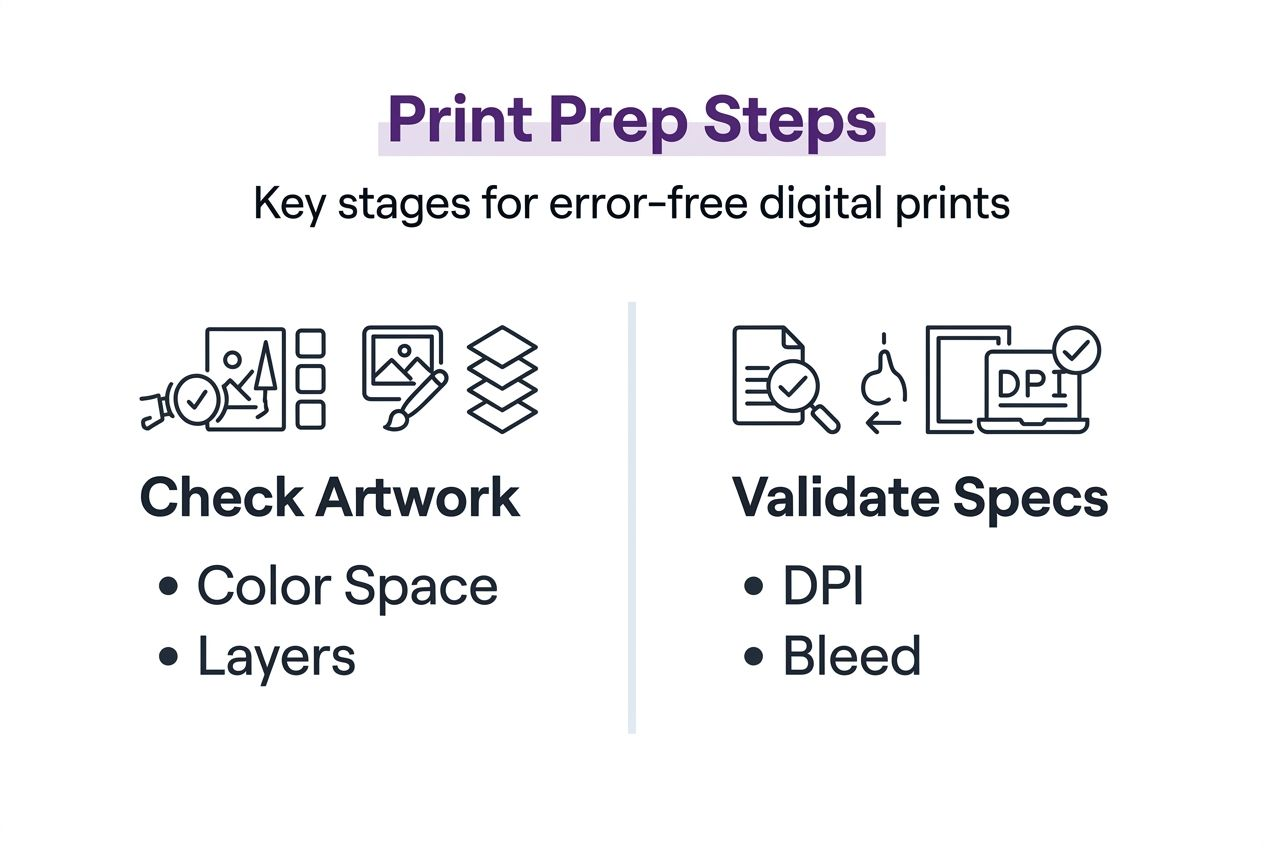
Validate DPI resolution at 300 or higher to ensure sharp, professional output. Lower resolution produces visible pixelation, especially on large format prints. Scale artwork proportionally when increasing size to maintain resolution integrity. Upsampling low-res images creates blurry results that no amount of sharpening fixes.
Set bleed margins to 0.125 inches around all edges that extend to trim lines. Bleed provides a safety buffer for slight cutting variations during finishing. Designs without adequate bleed show white slivers along edges after trimming. Background colors and images must extend fully into bleed areas.
Use built-in validation tools before exporting final files. Most design software includes preflight checks for resolution and bleed. LayerPrep print validation tools automatically verify these specifications during processing, flagging issues for correction.
Adjust artwork when validation reveals problems. Increase resolution by rescaling or sourcing higher quality images. Extend backgrounds and edge elements into bleed zones. Fix issues in your source files rather than attempting repairs after export.
Understand how these specifications prevent specific defects. Low DPI causes fuzzy text and jagged edges. Missing bleed creates white borders or forces content to pull away from edges. Both issues trigger reprints that waste time and materials.
Pro Tip: Build templates with correct DPI and bleed settings for your common print sizes. Starting from templates eliminates setup errors and ensures consistency across projects.
- Check DPI by examining image properties in your design software
- Zoom to 100% view to spot pixelation before printing
- Add guides showing trim and bleed boundaries
- Export PDFs with crop marks for printer guidance
- Request printed proofs for critical color and quality verification
Step 4: Automation tools for fast, accurate print-ready file creation
Automation transforms print file preparation from tedious manual labor into streamlined digital workflows. Modern AI tools handle separations, matching, and validation simultaneously.
LayerPrep AI automation exemplifies this shift. Upload artwork in PNG, JPG, PDF, or SVG format. Algorithms separate colors, match Pantone standards, validate resolution, and check bleed in approximately 30 seconds. Manual execution of identical tasks requires 30-60 minutes depending on design complexity.
AI-powered separation tools provide fast processing and consistent accuracy while reducing human errors. Color detection algorithms identify subtle shade variations that human eyes miss. Automated Pantone matching eliminates guesswork and speeds client approvals.
DPI and bleed validation happens automatically during processing. Software flags resolution below 300 DPI or insufficient bleed margins. Automated checks catch errors before files reach printers, preventing rejections and reprints.
Subscription models make professional tools accessible. Individual designer plans suit freelancers and small studios. Team subscriptions enable collaborative workflows with shared libraries and consistent output settings. Pricing scales with usage rather than requiring massive upfront software investments.
Speed improvements compound across multiple projects. Saving 45 minutes per design translates to 15 additional projects weekly for designers handling five jobs daily. Faster turnarounds improve client satisfaction and enable competitive pricing.
| Feature | Manual Process | AI Automation |
|---|---|---|
| Color separation time | 30-60 minutes | 30 seconds |
| Pantone matching accuracy | 60-70% | 70-95% |
| DPI validation | Manual checks | Automatic |
| Error rate | 15-30% | Under 5% |
| File format support | Limited | Multiple |
Pro Tip: Run test files through automation tools before committing to subscriptions. Most platforms offer trial projects to verify compatibility with your specific workflows and print methods.
- Start with simple designs to learn tool capabilities
- Compare automated output against manual separations initially
- Integrate automation into existing workflows gradually
- Train team members on consistent tool usage
- Archive settings and templates for repeat clients
Step 5: Troubleshooting common mistakes in print file preparation
Error prevention beats error correction. Recognizing typical mistakes helps you avoid print failures before they cost time and money.
Inaccurate color separations top the list of print prep failures. Colors bleed together, create unwanted overlaps, or miss design elements entirely. Software tools and AI validation catch these issues during processing. Manual reviews miss subtle problems that become obvious only after printing.
Low DPI resolution produces blurry, pixelated output. Designers sometimes mistake screen resolution (72 DPI) for print requirements (300 DPI minimum). Always verify resolution in image properties, not screen appearance. Upsampling low-res images never restores lost detail.
Insufficient bleed causes white borders after trimming. Extending backgrounds only to trim lines leaves no margin for cutting variations. Printers require 0.125-inch bleed around all edges that extend to trim boundaries.
File format incompatibilities create unexpected results. RGB colors in CMYK print jobs shift hues. Flattened files prevent color adjustments. Missing fonts default to system substitutes. Use proper formats and embed or outline fonts consistently.
Uncalibrated monitors cause color matching failures. Your screen displays colors differently than calibrated equipment. Monitor calibration ensures consistency from design to print. ICC profiles bridge the gap between display and output devices.
Up to 30% of screen printing jobs fail due to preventable file preparation errors. Most rejections stem from color separation mistakes, inadequate resolution, or missing bleed specifications.
Pro Tip: Create a rejection log tracking errors by type and frequency. Patterns reveal whether issues stem from knowledge gaps, workflow problems, or tool limitations requiring attention.
- Review LayerPrep troubleshooting tools for automated error detection
- Maintain calibrated backup monitors for color-critical work
- Request printer specifications before starting new projects
- Test print small samples before committing to large runs
- Document successful workflows for team reference and training
Expected outcomes: Measuring success in print-ready file preparation
Quantifiable metrics demonstrate workflow improvements. Tracking specific benchmarks shows whether your optimized process delivers promised benefits.
File preparation time drops dramatically with AI automation. Manual workflows consuming 30-60 minutes per design shrink to under one minute. Time savings multiply across dozens of weekly projects. Faster turnarounds enable competitive pricing and improved client satisfaction.
Pantone color matching accuracy improves to 70-95% using AI tools. Manual matching achieves 60-70% accuracy due to human judgment variations and monitor inconsistencies. Higher accuracy reduces revision rounds and speeds approvals.
Print job rejection rates fall below 5% when automated validation catches errors. Unvalidated files face 15-30% rejection rates. Each prevented rejection saves reprint costs, material waste, and deadline pressure.
Color fidelity consistency across print runs improves with standardized digital workflows. Manual processes introduce variations between jobs. Automated separations and validation produce identical results every time.
Workflow integration succeeds for both individual designers and teams. Solo practitioners gain efficiency. Teams achieve consistency through shared tools and standardized processes. Collaborative platforms enable multiple designers to maintain uniform output quality.
| Metric | Before Optimization | After Optimization |
|---|---|---|
| Prep time per file | 30-60 minutes | Under 1 minute |
| Pantone accuracy | 60-70% | 70-95% |
| Rejection rate | 15-30% | Under 5% |
| Weekly capacity | 20 projects | 50+ projects |
| Color consistency | Variable | Standardized |
These improvements compound over time. Designers handling 100 projects monthly save 50+ hours through automation. Reduced rejections eliminate thousands in wasted materials annually. Consistent quality builds client trust and generates referrals.
Measure your specific results using comparable metrics. Track prep times before and after implementing new tools. Monitor rejection rates from print shops. Survey clients about color accuracy satisfaction. Data-driven insights guide continued workflow refinement and justify tool investments to stakeholders.
Explore LayerPrep to revolutionize your print-ready file creation
Mastering the digital artwork print process requires the right tools combined with proven techniques. LayerPrep AI design color separator delivers automated workflows that eliminate manual bottlenecks plaguing traditional print preparation.
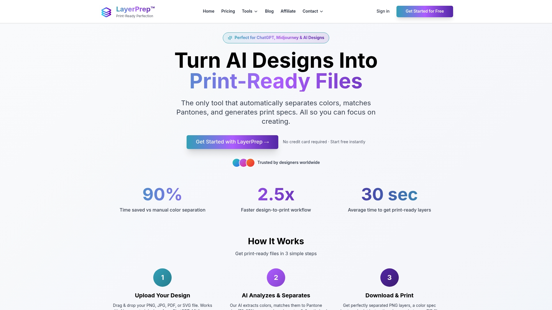
The platform handles color separations, Pantone matching, DPI validation, and bleed verification simultaneously in under 30 seconds. Support for multiple file formats including PNG, JPG, PDF, and SVG accommodates diverse design sources from traditional software and AI generators like Midjourney or ChatGPT.
LayerPrep screen print tools optimize separations specifically for screen printing workflows, while LayerPrep DTG tools handle direct-to-garment specifications. Subscription plans scale from individual designers to production teams requiring consistent output across multiple operators. Fast processing, reliable accuracy, and detailed output files position LayerPrep as an essential efficiency tool for modern print professionals.
FAQ
How do I choose between spot colors and CMYK for my print job?
Spot colors deliver exact Pantone matches ideal for logos, branding, and designs using five or fewer distinct colors. CMYK process printing suits full-color photographs, complex gradients, and artwork requiring unlimited color variations. Consider your print method since screen printing typically uses spot colors while digital printing accommodates both approaches. Cost implications matter too as spot color setups charge per color while CMYK uses four standard inks regardless of design complexity.
Can AI tools guarantee perfect Pantone color matching?
AI tools typically achieve 70-95% Pantone matching accuracy, constrained by physical printing variables like substrate texture, ink formulation, and press calibration. Perfect digital-to-physical color matching remains impossible due to fundamental differences between light-emitting screens and light-reflecting printed surfaces. However, AI dramatically improves reliability over manual matching methods prone to human judgment variations and uncalibrated monitor displays.
What file formats work best for print-ready files?
PDF, AI, and TIFF formats preserve layers, high resolution, and vector data essential for professional print production. These formats maintain quality during editing and support industry-standard color management. PNG and JPG work adequately for simple raster images but lack advanced print-ready features like spot color channels and embedded ICC profiles. Always verify format requirements with your specific print shop before finalizing files.
How can I reduce print job rejections caused by digital artwork errors?
Implement AI automation for color separations, Pantone matching, and technical validation to catch errors before submission. Always verify that resolution meets 300 DPI minimum standards and bleed extends 0.125 inches beyond trim lines. Use preflight checks built into design software or dedicated validation tools. Request printed samples for color-critical projects rather than relying solely on screen previews.