
Most designers assume a vibrant, high-resolution digital file is ready to print. It rarely is. Without following proper print output specifications, even a perfectly crafted design can come back from the printer with muddy colors, blurry text, or unexpected color shifts. This article breaks down exactly what specifications you need to meet, why each element matters, and how to build a reliable workflow that gets your files right the first time. Whether you're preparing files for screen printing, DTF, or commercial offset, these guidelines apply directly to your work.
Table of Contents
- Understanding print output specifications
- Core components of print-ready files
- Color management: Avoiding print surprises
- Troubleshooting and optimizing your print files
- Get expert help with print-ready file prep
- Frequently asked questions
Key Takeaways
| Point | Details |
|---|---|
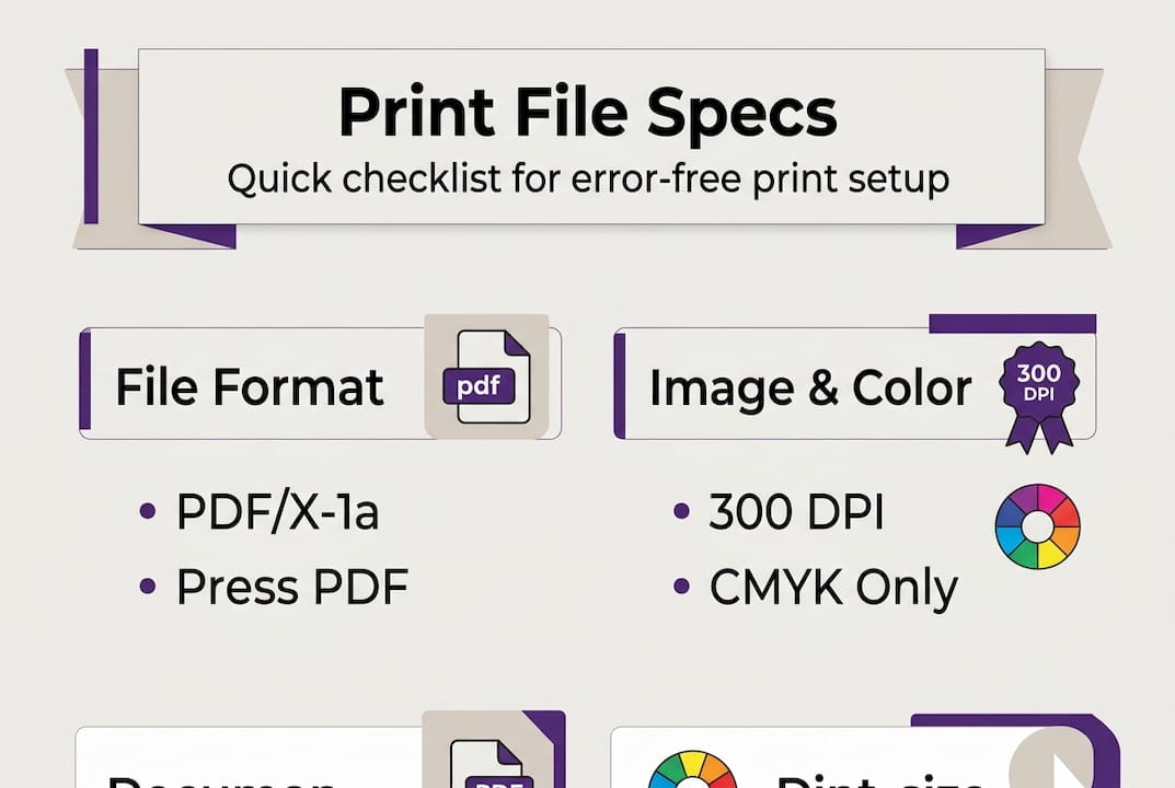
| Use PDF/X-1a format | PDF/X-1a ensures fonts are embedded, color is CMYK, and files are ready for press. |
| Convert to CMYK early | Converting design files to CMYK avoids color surprises and helps preview print results. |
| Check file links and resolution | Always confirm image links and maintain 300 dpi resolution for reliable output. |
| Flatten transparent effects | Flattening transparency prevents unintended results in print production. |
| Use a preflight checklist | Running a print-ready checklist helps catch errors and ensures flawless files. |
Understanding print output specifications
Print output specifications are standardized guidelines that define how a digital file must be structured before it goes to press. They exist because printers, substrates, and output devices all interpret files differently. A file that looks perfect on screen can fail completely in production if it doesn't meet the printer's requirements.
These specifications typically cover:
- Color mode: CMYK for most commercial printing, spot colors for screen printing
- File format: Structured formats that preserve all design data
- Resolution: Measured in DPI (dots per inch), the standard is 300 DPI for print
- Font handling: Fonts must be embedded or converted to outlines
- Bleed and safe zones: Extra artwork extending beyond the trim edge to prevent white borders
Understanding print design terminology is the first step toward building files that work. When you know what each term means, you can make informed decisions at every stage of your workflow.
The stakes are real. Missing a single specification can cause a reprint, delay a client's deadline, or result in a color that looks nothing like the approved proof. As a rule, the preferred file format is PDF/X-1a with embedded fonts, no transparency, and all linked images included. This format was built specifically for print production and removes most of the guesswork.
"Specifications are not suggestions. They are the contract between your design and the final printed piece."
Every printer, project type, and substrate has its own requirements. A file for a vinyl banner has different resolution needs than a business card. Always confirm specifications with your print provider before you start building.
Core components of print-ready files
With a clear understanding of what specifications are, let's look at the precise ingredients that make a file truly print-ready. Each component plays a specific role, and skipping any one of them introduces risk.
- File format: Use PDF/X-1a whenever possible. This format enforces CMYK color, embeds all fonts, and prohibits transparency. It is the most reliable format for commercial print production.
- Resolution: Set all raster images to 300 DPI at the final print size. Scaling up a low-resolution image after placement does not increase its DPI.
- Color mode: Convert all colors to CMYK before export. RGB files will be converted by the printer, often with unpredictable results.
- Font embedding: Embed all fonts or convert them to outlines. Missing fonts cause text reflow or substitution errors.
- Linked images: Collect all linked files and embed them. A missing link means a blank or low-resolution placeholder in your final output.
- Transparency: Flatten all transparency effects. Live transparency can render differently across RIP (raster image processor) systems.
- Bleed: Add at least 0.125 inches of bleed on all sides for trimmed pieces.
Here is a quick reference for the most common print specifications:
| Specification | Standard requirement | Notes |
|---|---|---|
| File format | PDF/X-1a or Press Quality PDF | Embed fonts, no transparency |
| Resolution | 300 DPI | At final print size |
| Color mode | CMYK | Convert from RGB before export |
| Bleed | 0.125 in (3mm) minimum | More for large format |
| Font handling | Embedded or outlined | Prevents substitution errors |
| Transparency | Flattened | Avoids RIP rendering issues |
Pro Tip: Run through a print-ready file checklist before every export. It takes two minutes and can save hours of back-and-forth with your print provider.
Building these habits into your error-free print workflow means fewer surprises and faster approvals. Consistency is what separates professionals from designers who are always chasing reprints.

Color management: Avoiding print surprises
One of the trickiest and most frequently misunderstood aspects of print output is color management. RGB (red, green, blue) is the color model used by screens. CMYK (cyan, magenta, yellow, black) is the model used by most printing processes. These two systems do not map perfectly to each other.
When you convert to CMYK early, you can preview color shifts before finalizing your artwork. Bright RGB colors like vivid oranges, electric blues, and neon greens often lose significant vibrancy when converted to CMYK. If you wait until export to convert, you may not notice the shift until the job comes back from the printer.
Here is a comparison of how RGB and CMYK behave in print production:
| Factor | RGB | CMYK |
|---|---|---|
| Primary use | Screens and digital displays | Commercial and offset printing |
| Color range (gamut) | Wider, more vibrant | Narrower, more accurate for print |
| Bright color accuracy | High on screen | Reduced in print |
| Best practice | Design stage only | Required for print export |
Common color management mistakes to avoid:
- Designing entirely in RGB and converting at the last step
- Using spot colors without confirming the printer supports them
- Ignoring soft proofing (previewing CMYK output on screen) during design
- Assuming the printer's conversion will match your intent
- Forgetting to check black settings (rich black vs. pure black for text)
Pro Tip: Use your design software's soft proof feature to simulate CMYK output before you finalize anything. In Adobe Illustrator or InDesign, go to View > Proof Colors to see how your design will shift. Adjust early, not after the fact.
Understanding separating colors for print is especially important for screen printing and DTF workflows, where each color is printed as a separate layer. Accurate color separation directly affects registration, ink coverage, and final output quality.
Troubleshooting and optimizing your print files
To ensure your work matches your intent, let's cover how to troubleshoot common problems and optimize your process for reliability. Most print errors are preventable. They happen because of skipped steps, not technical limitations.
Before you export any file for print, check these items:
- Missing links: Open your links panel and confirm every image shows as embedded or fully linked with no warnings
- Missing fonts: Run a font check and either embed all fonts or convert them to outlines before export
- Color mode: Confirm the document color mode is CMYK, not RGB
- Resolution: Check all placed images are at 300 DPI at their current size in the layout
- Transparency: Flatten all effects, drop shadows, and blending modes before saving
- Bleed marks: Confirm bleed is set correctly in your document setup and export settings
Pro Tip: Save a separate "print export" version of your file with all fonts outlined and transparency flattened. Keep your working file editable, but always export from the flattened version. This protects you from last-minute errors.
As the preferred file format is PDF/X-1a with embedded fonts and no transparency, exporting to this standard covers most of the checklist automatically. Make it your default export setting for any commercial print job.
"A five-minute preflight check before export is worth more than an hour of troubleshooting after a bad print run."
Avoiding print design mistakes is about building repeatable habits. When you follow efficient print workflows, you stop treating each job as a one-off and start treating it as part of a reliable system. A structured print production workflow reduces errors, speeds up approvals, and builds client trust over time.
The goal is not perfection on the first try every time. The goal is a process that catches problems before they become expensive.
Get expert help with print-ready file prep
You now have a solid foundation for understanding and applying print output specifications. Putting it all into practice consistently is where most designers and print shops lose time. Manual preflight checks, color conversions, and file organization add up fast, especially when you're handling multiple jobs at once.
LayerPrep automates the most time-consuming parts of print file preparation. It separates colors, validates DPI, matches Pantone colors with 70 to 95% accuracy, and checks bleed specifications automatically. Files are processed in an average of 30 seconds, and the platform accepts PNG, JPG, PDF, and SVG formats up to 50MB. Whether you're working with AI-generated artwork or traditional designs, LayerPrep handles the technical prep so you can focus on the creative work. Explore more about streamlining your print process and see how much time you can reclaim on every job.
Frequently asked questions
What is the best file format for commercial printing?
PDF/X-1a is preferred because it embeds fonts, uses CMYK only, and eliminates transparency, making it the most reliable format for consistent print output.
Why does converting RGB to CMYK affect my colors?
CMYK has a smaller color range than RGB, so bright RGB colors like vivid oranges and electric blues often appear duller or less saturated when printed.
How can I avoid print errors in my design files?
Check for embedded fonts, correct color mode, linked images, and flattened transparency before exporting. Running a preflight check every time catches most issues before they reach the printer.
What resolution should print files be?
300 DPI is the standard resolution for crisp, high-quality print results at the final output size. Anything lower risks visible pixelation in the finished piece.