Print accuracy determines whether your carefully crafted design becomes a masterpiece or a costly mistake. For print shop owners and graphic designers, achieving 98% color matching and registration within ±0.02mm isn't just technical excellence, it's the difference between satisfied clients and expensive reprints. This guide reveals the precise techniques, standards, and workflows that transform inconsistent output into reliable, high-quality prints every single time.
Table of Contents
- Understanding Print Accuracy: What It Means And Why It Matters
- Critical Techniques For Graphic Designers To Ensure Print Accuracy
- Print Shop Strategies To Maintain And Improve Print Accuracy
- How To Leverage Proofs, Color Management, And Standards For Flawless Results
- Enhance Your Print Accuracy Workflow With Layerprep
Key takeaways
| Point | Details |
|---|---|
| Print accuracy requires precise color, trapping, registration, and file preparation | These elements work together to ensure designs reproduce faithfully on physical media |
| Calibration and standardized workflows improve consistency across production runs | Following ISO standards reduces variability and waste in print operations |
| Designers must prepare files with correct color modes, bleed, and trapping | Proper file setup prevents common issues like color shifts and alignment errors |
| Automated RIP processes and registration marks reduce material waste | Technology aids shops in maintaining tight tolerances and reducing manual errors |
| Soft-proofing and contract proofs prevent costly reprints and client disputes | Verification tools catch problems before production begins |
Understanding print accuracy: what it means and why it matters
Print accuracy represents the overall precision in reproducing your design intent on physical prints. It encompasses multiple technical elements working in harmony to deliver consistent, high-quality results. When you understand these components, you gain control over the final product and eliminate guesswork from your workflow.
Print accuracy encompasses precise color, trapping, registration, and file standards to ensure quality. Color matching ensures your chosen hues appear correctly on substrate. Trapping involves overlapping adjacent colors slightly to prevent white gaps when registration shifts microscopically during production. Registration refers to the alignment of color plates or layers, measured in fractions of millimeters. Resolution determines image sharpness, while bleed and safety margins protect critical content from being trimmed.
The importance of print accuracy becomes clear when you calculate costs. A single misaligned print run can waste hundreds of sheets, thousands of dollars in materials, and damage client relationships. Color shifts force reprints that delay delivery schedules. Poor design files in printing workflows create bottlenecks that slow production and frustrate teams.
Both designers and print shops share responsibility for accuracy. Designers control file preparation, color mode selection, and proper setup of technical specifications. Print shops manage equipment calibration, process control, and quality verification. When both parties execute their roles correctly, the result is seamless production with minimal waste and maximum client satisfaction.
Key elements that define print accuracy include:
- Color fidelity measured by Delta E values comparing printed output to reference standards
- Trapping specifications that compensate for mechanical registration tolerances
- Registration precision typically held within ±0.02mm for commercial work
- Resolution standards ensuring crisp reproduction of fine details and text
- Bleed and safety zones protecting content from trim variations
Critical techniques for graphic designers to ensure print accuracy
Graphic designers control the foundation of print accuracy through proper file preparation. Your choices in color mode, resolution, and technical setup directly impact how faithfully your vision translates to physical media. Mastering these techniques eliminates the most common causes of print failures.
Designers should always use CMYK, include 0.125in bleed, and apply 0.025-0.125mm choke/spread trapping for offset printing. Working in CMYK color mode from the start prevents disappointing color shifts that occur when RGB designs convert during output. Many vibrant RGB colors fall outside the CMYK gamut, meaning they cannot be reproduced accurately in standard four-color printing.
Bleed extends your design 0.125 inches beyond the final trim size on all sides. This safety buffer ensures that if the cutting blade shifts slightly during trimming, you won't see white edges on your finished piece. Safety margins work inversely, keeping critical text and design elements at least 0.125 inches inside the trim line to prevent accidental cropping.
Vector graphics and raster images require different resolution approaches. Vectors scale infinitely without quality loss, making them ideal for logos and text. Raster images need 300 DPI at final size for sharp reproduction. Lower resolution creates visible pixelation, while excessive resolution unnecessarily increases file size without improving output quality.
Trapping prevents white gaps between adjacent colors. Choke trapping slightly reduces the lighter color, while spread trapping expands it into the darker color. The overlap amount typically ranges from 0.025mm to 0.125mm depending on press type and substrate. Many designers let RIP software handle trapping automatically, but understanding the principle helps you design with production realities in mind.
Soft-proofing simulates how your design will print using ICC color profiles. This preview reveals how colors will shift from screen to print, allowing adjustments before committing to production. Viewing your soft proof under standardized lighting conditions provides the most accurate preview of final results.
Pro Tip: Create a preflight checklist for every project including CMYK verification, bleed check, resolution audit, and font outlining. This systematic approach catches errors before files reach the print shop, saving time and building your reputation for delivering clean, production-ready files. Integrate this checklist into your efficient print design workflows for consistent results.
Print shop strategies to maintain and improve print accuracy
Print shops maintain accuracy through equipment calibration, process standardization, and quality control systems. These operational practices ensure consistent output regardless of operator, shift, or substrate variations. Understanding shop-side accuracy measures helps designers prepare files that integrate seamlessly into production workflows.
Print shops implement automated trapping in RIP software and calibrate presses to ISO 12647 to ensure precision. Automated trapping eliminates human error and maintains consistent overlap values across all color boundaries. The RIP analyzes file geometry and applies mathematically precise trapping based on color relationships and press characteristics.
Press calibration to ISO 12647 standards establishes repeatable color output. This international standard defines target densities, dot gain curves, and color values for different printing processes and substrates. Calibrated presses produce predictable results that match industry benchmarks, enabling accurate color communication between designers, clients, and print providers.
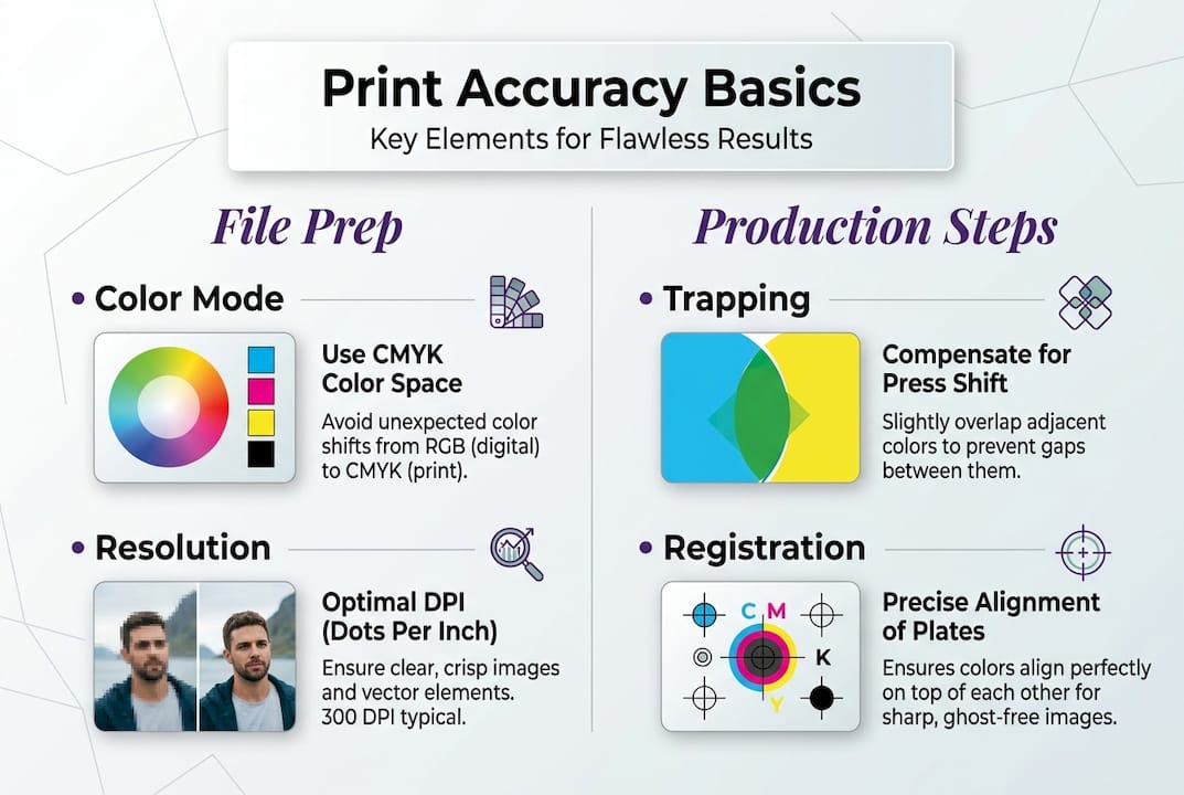
Registration marks guide finishing equipment to align within ±0.02mm tolerance. These targets appear outside the trim area and provide reference points for cutting, folding, and additional print passes. Automated systems read these marks optically, adjusting position in real time to maintain precise alignment throughout the production run.
Onsite trapping measurement using spectrodensitometers catches problems before they become waste. Operators measure trap quality by comparing the density of overlapped colors to their individual densities. This verification ensures trapping achieves its purpose of hiding registration variations without creating visible color shifts or halos.
| Method | Accuracy Level | Best Use Case |
|---|---|---|
| Manual trapping | ±0.05mm | Small runs, specialized work |
| Automated RIP trapping | ±0.025mm | High-volume production |
| In-RIP soft proofing | Delta E <2 | Color-critical projects |
| Press-side measurement | Real-time monitoring | Quality assurance |
The difference between manual and automated processes impacts both speed and consistency. Manual trapping requires skilled operators who understand color relationships and press behavior. Automated systems apply consistent rules instantly but require proper setup and occasional verification. Most modern shops combine both approaches, using automation for standard work and manual intervention for complex or unusual projects.
Pro Tip: Request a press calibration report from your print provider before starting color-critical projects. This documentation shows their commitment to standards and provides baseline data for troubleshooting if color issues arise. Shops that optimize print workflow through calibration deliver more predictable results.
How to leverage proofs, color management, and standards for flawless results
Proofs, viewing standards, and color management systems form the verification layer that confirms accuracy before production begins. These tools catch discrepancies early, prevent miscommunication, and establish shared expectations between all project stakeholders. Proper use of these resources dramatically reduces reprints and disputes.
Contract proofs with Delta E reports reduce reprints; aligning on ISO 3664 viewing avoids metamerism disputes. Delta E quantifies color difference numerically, with values under 2 considered a close match and values over 5 easily perceptible. Contract proofs include these measurements, providing objective data rather than subjective opinions about color accuracy.
ISO 3664 defines standardized viewing conditions that eliminate metamerism, the phenomenon where colors appear different under varying light sources. This standard specifies 5000K color temperature, specific illumination levels, and neutral gray surroundings. When you and your client view proofs under these conditions, you see the same colors and make consistent approval decisions.
Extended gamut printing using CMYKOG (cyan, magenta, yellow, black, orange, green) expands the range of reproducible colors beyond standard CMYK. This approach matches more Pantone colors and vibrant hues without custom ink mixing. However, process CMYK remains preferred for most work due to simpler workflows, lower costs, and broader shop compatibility.
Steps to request and interpret proofs for maximum accuracy:
- Specify proof substrate matching your final printing stock for accurate color preview
- Request Delta E measurements comparing proof to digital file reference values
- Review proofs under ISO 3664 viewing conditions, never under office fluorescent lighting
- Mark any areas requiring adjustment directly on the proof with specific instructions
- Approve proofs in writing to establish the color standard for production
| Delta E Value | Perception | Action Required |
|---|---|---|
| 0 to 1 | Imperceptible difference | Proceed to production |
| 1 to 2 | Perceptible by trained eye | Acceptable for most work |
| 2 to 5 | Noticeable color shift | Adjust if color-critical |
| Above 5 | Obvious mismatch | Correction mandatory |
These practices boost confidence throughout the production chain. Designers gain assurance their vision will reproduce accurately. Print shops work from clear targets rather than assumptions. Clients approve with full understanding of final appearance. This alignment prevents the costly cycle of rejection, adjustment, and reprint that plagues projects lacking proper verification.
Choosing between process and extended gamut depends on project requirements. Extended gamut shines for packaging, branding materials, and designs featuring vibrant spot colors. Process CMYK works better for publications, general commercial printing, and projects requiring broad vendor compatibility. Understanding these tradeoffs helps you specify the right approach for each project's priorities and constraints.
Color management systems tie everything together by maintaining consistent color from capture through output. ICC profiles describe how devices reproduce color, enabling accurate translation between different equipment. When you embed profiles in your files and your print shop uses matching output profiles, colors remain true throughout the workflow. This systematic approach to precise color accuracy eliminates guesswork and delivers predictable results.
Enhance your print accuracy workflow with LayerPrep
Achieving consistent print accuracy requires precise color separation, proper file preparation, and meticulous attention to technical specifications. LayerPrep AI color separator automates these critical tasks, helping both designers and print shops eliminate errors while accelerating turnaround times.
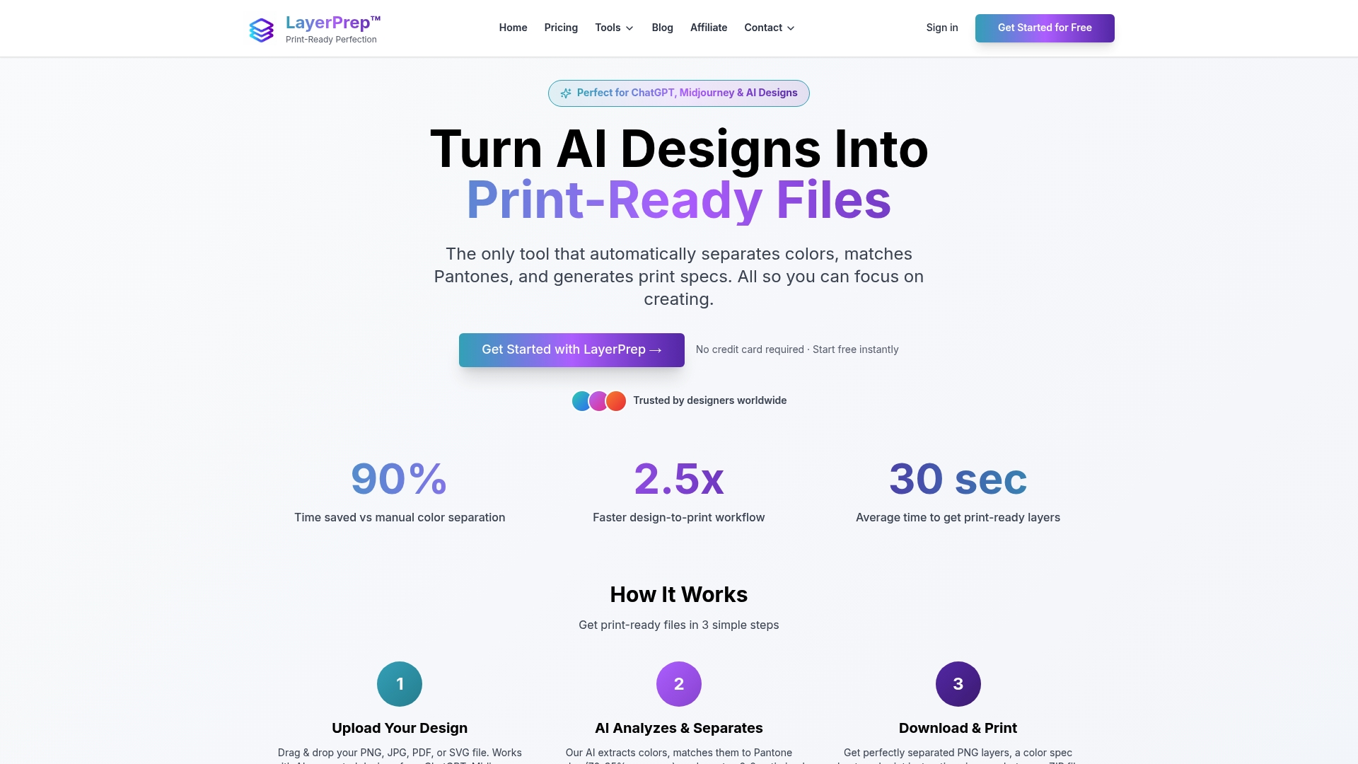
LayerPrep analyzes your designs and automatically separates colors with accuracy rates between 70% and 95% for Pantone matching. The platform validates DPI resolution, checks bleed specifications, and prepares print-ready layers in an average of 30 seconds. It handles complex gradients and files up to 50MB across multiple formats including PNG, JPG, PDF, and SVG. Whether you're working with AI-generated designs or traditional artwork, LayerPrep integrates seamlessly into existing workflows to boost accuracy and consistency across all your print projects.
Frequently asked questions
What is print accuracy?
Print accuracy measures how precisely printed output matches the intended design in color, alignment, and overall quality. It encompasses color fidelity, registration precision, proper trapping, correct resolution, and appropriate bleed specifications. High print accuracy means your final printed piece looks exactly as you designed it, with colors matching your specifications, elements aligned correctly, and no unwanted gaps or shifts. This precision reduces waste, prevents reprints, and ensures client satisfaction across all printing methods.
How does trapping improve print accuracy?
Trapping compensates for slight misalignments during printing by creating controlled overlaps between adjacent colors. When printing presses register multiple color plates, microscopic shifts can occur, potentially creating thin white gaps where colors should meet. Trapping intentionally overlaps these boundaries by 0.025mm to 0.125mm, ensuring that even if registration shifts slightly, the overlap hides any gaps. Proper trapping measurement onsite using spectrodensitometers verifies that these overlaps achieve their purpose without creating visible color shifts, directly reducing print waste from registration errors.
Why is press calibration important for print accuracy?
Press calibration standardizes color output and ensures consistent quality across different production runs, shifts, and operators. Calibrating to ISO 12647 establishes specific target values for ink density, dot gain, and color reproduction that match industry benchmarks. Without calibration, presses drift over time due to wear, environmental changes, and consumable variations, leading to unpredictable color shifts. Calibrated presses produce repeatable results that match proofs and client expectations, enabling reliable color communication throughout the supply chain and reducing costly reprints from color mismatches.
What should graphic designers include in print-ready files?
Designers must use the CMYK color model rather than RGB to ensure accurate color reproduction in print. Files should include 0.125 inch bleed extending beyond trim lines and maintain safety margins of at least 0.125 inch inside trim for critical content. Vector graphics should be used where appropriate, while raster images must be 300 DPI at final size. Apply trapping adjustments between 0.025mm and 0.125mm for adjacent colors, or allow RIP software to handle this automatically. Always soft-proof files using ICC profiles that match the intended printing process before submission to catch potential color shifts or issues.