You've spent hours perfecting a design, sent it to print, and received results that look nothing like your screen mockup. Blurry images, wrong colors, or missing bleeds turn your masterpiece into an expensive mistake. These frustrations stem from preventable print design errors that plague even experienced designers. Understanding and avoiding common pitfalls in file setup, color management, layer organization, and workflow validation transforms your print production process. This guide walks you through the most frequent print design mistakes and provides actionable solutions to ensure your next project delivers flawless results every time.
Table of Contents
- Essential Print Design Setup Errors To Avoid
- Common Color And Proofing Mistakes In Print Design
- Handling Layers And File Complexity Mistakes
- Avoiding Workflow Pitfalls And Validation Errors
- Streamline Your Print Design Workflow With LayerPrep
Key takeaways
| Point | Details |
|---|---|
| Setup errors cause failures | Incorrect resolution, color modes, and bleed settings lead to poor quality prints and costly reprints. |
| Color accuracy requires planning | Proper CMYK profiles and Pantone matching prevent unexpected color shifts and customer dissatisfaction. |
| Layer management matters | Organized, clean files with properly structured layers streamline production and reduce errors. |
| Proofing saves money | Catching mistakes before printing eliminates expensive reruns and maintains client relationships. |
| Workflow optimization prevents chaos | Automated validation and clear communication with print providers ensure consistent, error-free results. |
Essential print design setup errors to avoid
Getting your file setup right from the start prevents 80% of common print failures. Many designers create beautiful work only to discover their files won't print correctly because of fundamental configuration mistakes. Incorrect resolution and color mode cause poor print quality and frustrating color shifts that require expensive corrections.
Start every print project by verifying these critical specifications:
- Set resolution to 300 dpi minimum for sharp, professional output
- Switch color mode to CMYK before designing, not after completion
- Add 0.125 inch bleed on all sides to prevent white edges
- Match document dimensions exactly to final trim size
- Embed all fonts or convert text to outlines before submission
Resolution mistakes rank among the most common setup errors. Designers working primarily for web often forget that 72 dpi screens require vastly different specifications than physical prints. A gorgeous Instagram graphic at 1080x1080 pixels looks terrible when printed at business card size because the resolution drops far below acceptable standards.
Color mode confusion creates even more headaches. RGB files display vibrant colors on screens but translate poorly to CMYK printing processes. That brilliant electric blue in your design might print as a dull purple because RGB contains colors outside the CMYK gamut. Always start in CMYK when designing for print, or accept that significant color adjustments will be necessary during conversion.
Bleed and trim settings seem technical but matter enormously for professional results. Without proper bleed, your carefully chosen background colors might show white slivers along edges after trimming. Printers need that extra 0.125 inch overlap to account for slight variations in cutting accuracy.
Pro Tip: Create design templates with correct specifications for your most common print jobs. Save these templates with embedded color profiles, proper resolution, and bleed settings so you never start a project with wrong configurations. Review design file preparation basics to build foolproof templates.
Common color and proofing mistakes in print design
Color accuracy separates amateur prints from professional results, yet remains one of the trickiest aspects of print design. Accurate color profiles and proofing reduce unexpected shifts that disappoint clients and waste materials. Understanding how color works in print versus screen environments protects you from costly surprises.
The biggest color mistakes designers make include:
- Using RGB color mode for files destined for CMYK printing
- Selecting Pantone colors without verifying printer capabilities
- Ignoring overprint settings that create unintended color mixing
- Skipping soft proofs before approving final production
- Assuming screen colors will match printed output exactly
Pantone matching presents unique challenges because not all printers support spot color printing. You might specify Pantone 185 C for a client's brand red, only to discover the print shop converts it to CMYK approximation. This conversion rarely produces exact matches, especially for vibrant or metallic colors outside the CMYK range.
| Color Issue | Cause | Solution | | --- | --- | | Muddy colors | RGB to CMYK conversion | Design in CMYK from start | | Banding in gradients | Low resolution or bit depth | Use 300 dpi, 8 bit minimum | | Inconsistent hues | Mixed color spaces | Standardize on one color mode | | Unexpected overprints | Default transparency settings | Review and adjust overprint options |
Proofing serves as your safety net against color disasters. Digital soft proofs on calibrated monitors help, but physical proof prints reveal issues that screens cannot show. Paper type, ink absorption, and printing method all affect final color appearance in ways impossible to predict from screen viewing alone.
Many designers skip proofing to save time or money, then face much larger expenses fixing problems after full production runs. A $50 proof print catches errors that might cost $500 or more to reprint. Smart designers build proofing time and costs into every project timeline and budget.
Pro Tip: Maintain a physical swatch library of your most used colors printed on common paper stocks. This reference library helps you make informed color choices and set realistic client expectations. Check the color accuracy expert guide for advanced color management techniques.
Handling layers and file complexity mistakes
Poorly organized files create production nightmares that waste time and introduce errors. Efficient print files with organized layers improve workflow and help print technicians process your work correctly. Messy layer structures force printers to guess your intentions, often with disappointing results.
Common layer management mistakes that disrupt print production:
- Leaving dozens of unnamed layers like "Layer 1 copy 3"
- Hiding elements instead of deleting unused objects
- Flattening all layers too early and losing editability
- Including transparent objects without understanding print implications
- Forgetting to merge adjustment layers before export
Layer naming seems trivial until a print technician needs to separate colors or make last minute adjustments. Clear names like "Background Blue" or "Logo Black" communicate your design intent instantly. Cryptic default names force technicians to examine every layer individually, increasing both time and error risk.
Transparency effects deserve special attention because they behave differently in print than on screen. Overlapping transparent objects might look perfect in your design software but cause unexpected color shifts or white gaps when rasterized for printing. Always flatten transparency carefully and check results before submission.
Follow these steps to prepare clean, print ready files:
- Review all layers and delete any unused or hidden elements
- Rename remaining layers with clear, descriptive titles
- Group related elements logically for easy navigation
- Flatten only when absolutely necessary, keeping a layered backup
- Run a final check for stray objects outside artboard boundaries
- Save a flattened copy specifically for print submission
File complexity increases exponentially with unnecessary elements. Every hidden layer, unused color swatch, or embedded image adds file size and processing time. Bloated files slow down printing workflows and sometimes cause software crashes during processing.
Keep files lean by routinely cleaning up as you work rather than leaving cleanup for the end. Delete rejected design versions, remove unused swatches and brushes, and compress embedded images appropriately. Your print provider will thank you with faster turnaround and fewer technical issues. Explore the print layers guide for detailed layer organization strategies.
Avoiding workflow pitfalls and validation errors
Even perfectly prepared files fail without proper workflow management and validation. Print validation and optimized workflows boost success while reducing errors that damage client relationships and profit margins. Systematic approaches to file checking and printer communication prevent most workflow disasters.
Manual validation relies on designer expertise and attention to detail. You personally review every specification, check each color, and verify all measurements before submission. This approach works for small volumes but becomes unsustainable as project numbers increase. Human error creeps in when you're rushing to meet deadlines or handling multiple jobs simultaneously.
Automated validation uses software tools to check files against preset criteria. These systems flag resolution issues, color mode problems, missing bleeds, and other technical errors instantly. Automation catches mistakes you might overlook when tired or distracted, providing consistent quality control regardless of workload pressure.
| Validation Approach | Advantages | Disadvantages | | --- | --- | | Manual checking | Free, flexible, designer controlled | Time consuming, error prone, not scalable | | Automated software | Fast, consistent, catches technical errors | Requires investment, may miss design issues | | Hybrid method | Combines speed with human judgment | Needs training, workflow integration |
Communication gaps between designers and print providers cause unnecessary problems. Assumptions about printer capabilities, paper stocks, or turnaround times lead to disappointment and rushed corrections. Establish clear communication channels and ask questions before starting projects, not after discovering issues.
Create a preflight checklist covering these essential validation points:
- Confirm color mode matches printing process
- Verify resolution meets minimum 300 dpi standard
- Check bleed extends 0.125 inch on all sides
- Validate all fonts are embedded or outlined
- Review file format matches printer requirements
- Confirm dimensions match final trim specifications
Version control prevents confusion when making revisions. Name files systematically with version numbers and dates, like "ClientLogo_v3_2026-01-15.pdf" rather than vague names like "final_FINAL_revised.pdf". Clear naming helps everyone track which version is actually approved for printing.
Pro Tip: Build a standard operating procedure document for your print workflow. Include your preflight checklist, preferred printer contacts, common specifications for different project types, and lessons learned from past mistakes. This living document becomes invaluable training material for team members and a reference when you need to troubleshoot issues. Review print workflow optimization strategies to refine your processes.
Streamline your print design workflow with LayerPrep
Avoiding print mistakes becomes significantly easier with the right tools supporting your workflow. LayerPrep automates the tedious technical checks that cause most print failures, freeing you to focus on creative work instead of file preparation anxiety.
Our AI powered platform handles color separation, Pantone matching, resolution validation, and bleed checking automatically. Upload your design and receive print ready layers in roughly 30 seconds, with 70 to 95% Pantone accuracy that rivals manual color separation. The system accepts PNG, JPG, PDF, and SVG files up to 50MB, managing complex gradients and AI generated artwork with equal ease.
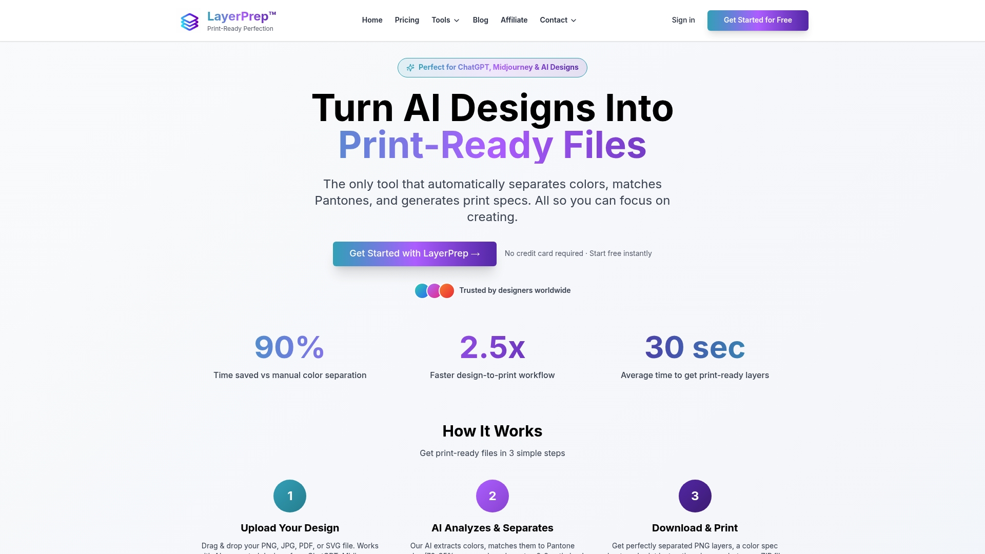
LayerPrep integrates smoothly into existing workflows whether you're an independent designer or part of a production team. Subscription plans scale from individual use to team collaboration, providing the flexibility your business needs. Stop worrying about technical specifications and start delivering flawless prints consistently. Explore LayerPrep pricing options or visit the LayerPrep homepage to transform your print production process today.
FAQ
What resolution should I use to avoid print quality issues?
Set your design files to 300 dpi minimum for professional print quality. This resolution ensures sharp text, clean lines, and detailed images without visible pixelation. Lower resolutions like 72 or 150 dpi might look acceptable on screen but produce blurry, unprofessional prints that disappoint clients.
Why is converting RGB files to CMYK important for print?
Printers use CMYK inks rather than RGB light to create colors on paper. RGB colors often fall outside the CMYK gamut, meaning they cannot be reproduced accurately in print. Converting to CMYK before designing lets you see realistic color representation and avoid unexpected shifts when files reach the printer.
How can proofing prevent costly print mistakes?
Proofing catches layout errors, color inaccuracies, and content mistakes before full production runs begin. A proof print costs a fraction of reprinting an entire job and reveals how your design actually looks on the intended paper stock. This small investment saves significant money and protects client relationships by ensuring satisfaction before final delivery.
What are best practices for organizing layers in print files?
Name every layer clearly to communicate your design intent to print technicians. Remove all unused or hidden layers to reduce file complexity and processing time. Flatten transparency effects carefully while maintaining a layered backup file for future edits. Group related elements logically so anyone opening your file can navigate it efficiently without guessing your organizational system.