Print shop owners and graphic designers know the frustration of watching a vibrant design on screen transform into a disappointing print with muddy colors and unexpected shifts. Color accuracy challenges cost time, materials, and client trust. This comprehensive guide demystifies the science behind accurate color reproduction and provides actionable strategies to achieve consistent, professional print results. You'll learn the fundamentals of color spaces, ICC profiling, calibration techniques, and workflow best practices that eliminate guesswork and deliver prints that match your vision every time.
Table of Contents
- Understanding The Fundamentals Of Color Accuracy In Printing
- Core Components Of Color Reproduction: Tone, Gray Balance, And Selective Correction
- Building A Reliable Color Management System For Print Accuracy
- Addressing Color Accuracy Challenges And Workflow Best Practices
- Enhance Your Print Workflow With LayerPrep's AI Color Separation
- Frequently Asked Questions About Color Accuracy In Printing
Key takeaways
| Point | Details |
|---|---|
| Color spaces and profiles | Understanding RGB versus CMYK and using ICC profiles ensures predictable color translation from screen to print. |
| Calibration and characterization | Regular device calibration and creating accurate ICC profiles through spectrophotometer measurements maintain consistent output. |
| Tone and gray balance | Controlling halftone dot percentages and achieving neutral grays through proper ink mixing prevents color casts and maintains contrast. |
| Common challenges | Metamerism, gamut limitations, and ink behavior variations require careful material selection and testing to overcome. |
| Systematic workflow | Implementing the 6 C's of color management with G7 calibration standards reduces waste and improves production efficiency. |
Understanding the fundamentals of color accuracy in printing
Color accuracy in printing relies on understanding RGB versus CMYK differences and how devices reproduce color through systematic management. Screens use RGB, an additive color model where red, green, and blue light combine to create colors. Printers use CMYK, a subtractive model where cyan, magenta, yellow, and black inks absorb light wavelengths. This fundamental difference means converting digital designs to print requires careful translation to avoid unexpected color shifts.
Color spaces define the range of colors a device can reproduce. sRGB is the standard for web graphics with a relatively narrow gamut. Adobe RGB offers a wider range suitable for photography and professional design work. CMYK color spaces vary by printing method, substrate, and ink formulation. Your choice of color space impacts which colors translate accurately and which require compromise during conversion.
ICC profiles characterize device color reproduction and serve as the foundation for color management systems. These profiles act as translators between different devices, describing how a specific printer, monitor, or scanner interprets color values. Without accurate profiles, you're essentially guessing how colors will appear in the final print. Creating custom ICC profiles for your specific equipment and materials dramatically improves color predictability.
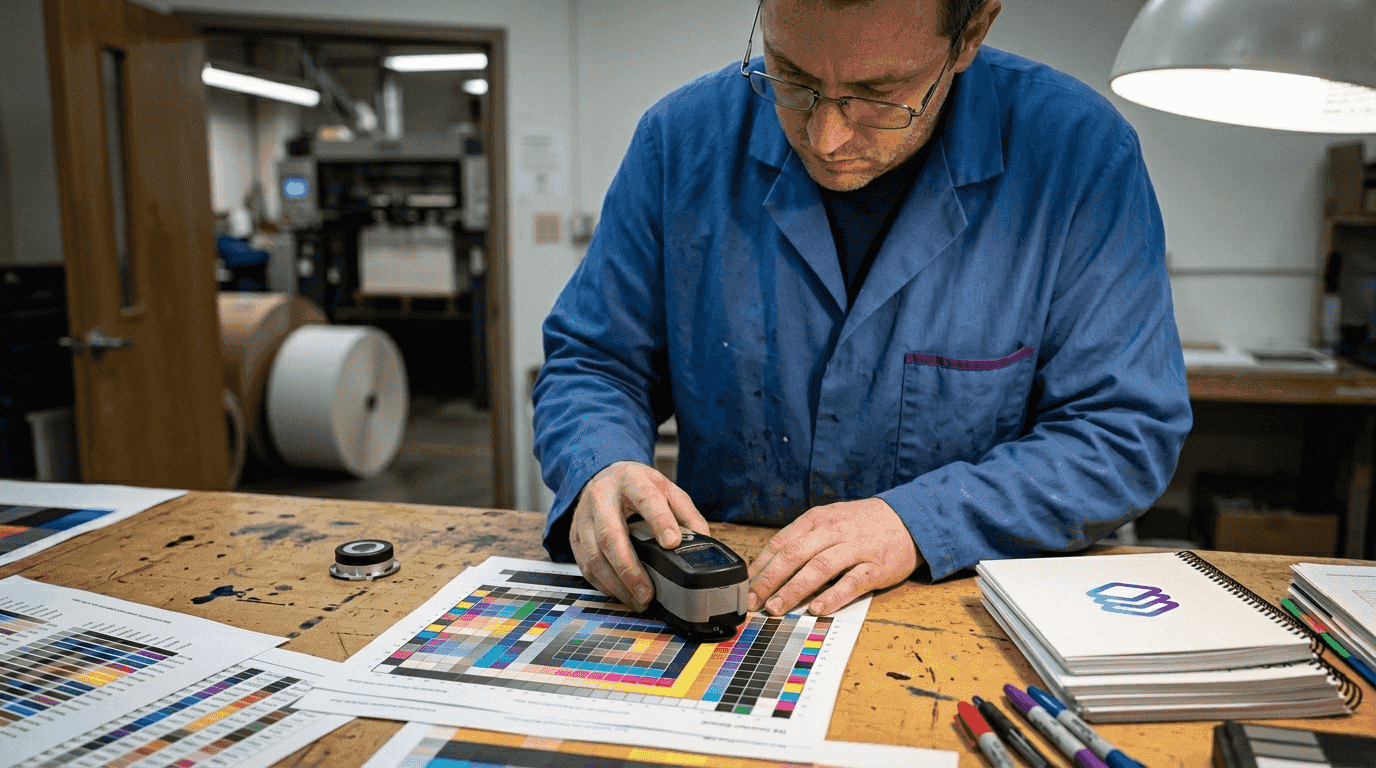
Calibration aligns your devices to produce predictable, standardized output that matches their ICC profiles. A calibrated monitor displays colors accurately so you can make informed design decisions. Calibrated printers produce consistent results that match their characterization data. Hardware tools like colorimeters and spectrophotometers measure actual color output and help adjust devices to meet standards.
Implementing proper color management requires both software and hardware investments. Color management software uses ICC profiles to convert colors between devices intelligently. Spectrophotometers measure printed color patches to create profiles and verify calibration accuracy. These tools work together to streamline digital artwork print process workflows and eliminate costly reprints.
Pro Tip: Create separate ICC profiles for each paper stock and ink combination you use regularly. Substrate characteristics significantly affect color reproduction, and generic profiles can't account for these variables.
Essential color management components:
- Hardware calibration devices measure and adjust monitor and printer output to standards
- Color management modules in design software apply ICC profiles during file creation
- Spectrophotometers create custom profiles by measuring printed color targets
- Reference viewing booths provide standardized lighting for evaluating print samples
- Regular testing with control strips verifies ongoing calibration accuracy
Core components of color reproduction: tone, gray balance, and selective correction
Accurate color reproduction relies on tone reproduction, gray balance, and selective color correction working in harmony. These three elements determine whether your prints maintain proper contrast, neutral colors, and accurate hues. Mastering them separates amateur results from professional quality output that clients expect.
Tone reproduction describes the relationship between original image density and halftone dot area in the printed reproduction. It controls contrast and detail preservation throughout the tonal range. Poor tone reproduction causes highlights to blow out or shadows to block up, losing critical detail. Proper tone curves maintain smooth gradations from white to black while preserving texture in both bright and dark areas.
Gray balance issues cause color casts that make prints appear too warm, cool, or tinted. Achieving neutral grays requires precise mixing of cyan, magenta, and yellow inks in specific ratios. These ratios vary by printing process, substrate, and ink formulation. When gray balance is correct, neutral tones from light gray to dark gray contain no visible color bias. This neutrality serves as the foundation for accurate color reproduction across the entire spectrum.
Selective color correction compensates for imperfections in inks and substrates that affect specific hues. Real world printing inks aren't perfectly pure, and paper characteristics influence how colors appear. Cyan ink may have slight magenta contamination. Yellow ink might be too warm or cool. These imperfections cause predictable color shifts that selective correction can address.
Photoshop's Selective Color adjustment tool provides precise control over individual color families without affecting others. You can add or remove cyan, magenta, yellow, or black from reds, yellows, greens, cyans, blues, or magentas independently. This granular control helps you master efficient print design workflows by compensating for known printing limitations before files leave your design environment.
Pro Tip: Print a gray scale and color bar with every job. These reference elements let you quickly identify tone reproduction problems, gray balance shifts, or color accuracy issues before committing to full production runs.
Steps to optimize color reproduction:
- Establish proper tone curves through linearization testing and adjustment
- Measure and correct gray balance using spectrophotometer readings of neutral patches
- Apply selective color correction based on known ink and substrate characteristics
- Verify results with printed test targets comparing to reference standards
- Document successful settings for repeatable results across similar jobs
Building a reliable color management system for print accuracy
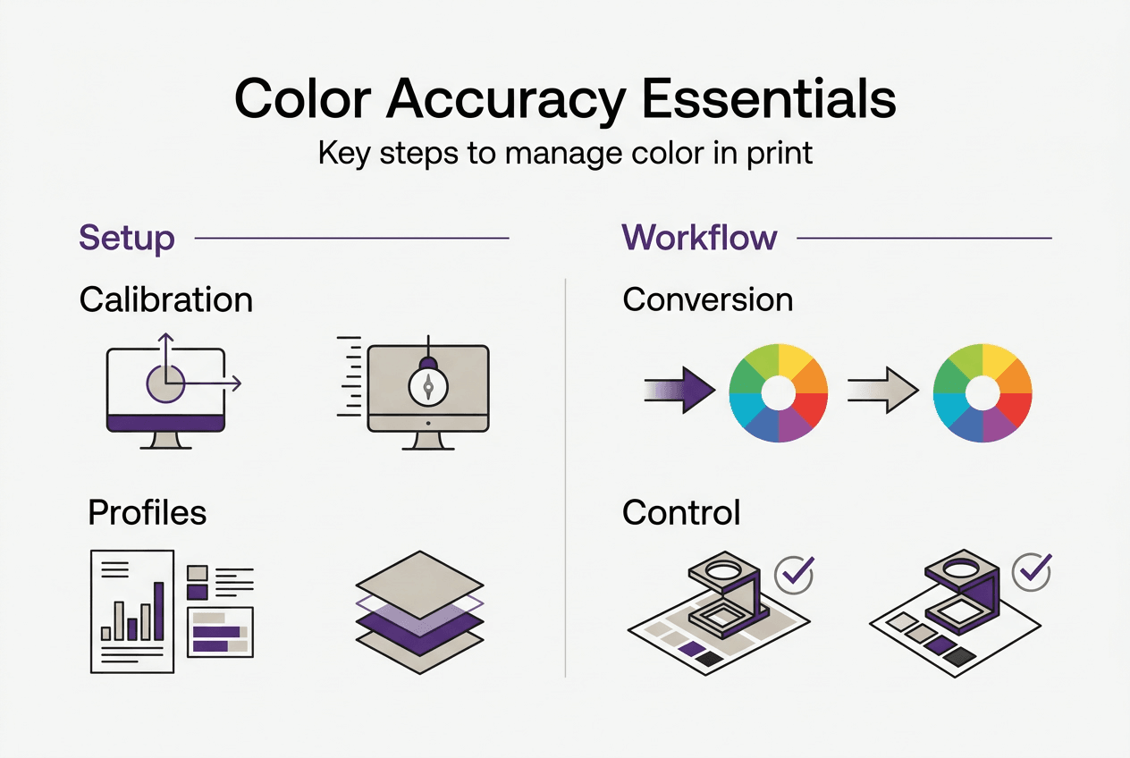
Color accuracy requires systematic management encompassing consistency, calibration, characterization, conversion, control, and conformance. This comprehensive approach, known as the 6 C's of color management, provides a framework for achieving predictable results. Each component plays a specific role in translating design intent to physical print.
Calibration ensures predictable device responses through adjustments like gray balance, linearization, and tone curves. Modern calibration often follows G7 methodology, which aligns printing devices based on neutral gray appearance rather than mechanical attributes. This approach accommodates variations in equipment while maintaining consistent visual results. Calibration should occur regularly, with frequency depending on equipment stability and quality requirements.
Characterization creates ICC profiles by printing standardized color targets and measuring them with a spectrophotometer. These targets contain hundreds of color patches representing the device's full gamut. Measurement data describes exactly how the device reproduces each color value. The resulting ICC profile becomes the device's color fingerprint, enabling accurate color translation.
Conversion uses ICC profiles to translate colors between devices and color spaces intelligently. Color management modules in design software and RIP systems apply these profiles automatically. The conversion process considers source and destination gamuts, rendering intents, and color appearance models. Proper conversion preserves color relationships even when exact matches aren't possible.
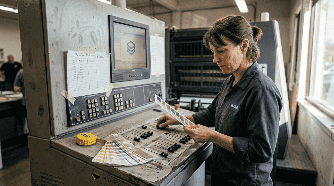
Control involves monitoring print runs to detect deviations from established standards. Inline spectrophotometers can measure color during production, alerting operators to drift before significant waste occurs. Regular press checks with control strips verify that calibration remains accurate. This ongoing vigilance maintains the consistency that professional printing demands.
G7 calibration aligns printing machines based on achieving neutral gray balance and consistent tone reproduction across different devices. This methodology enables predictable color matching between dissimilar equipment. Print shops using G7 can maintain brand color consistency across offset, digital, and wide format printing technologies. The approach focuses on what the eye sees rather than mechanical specifications.
Implementing these systems helps you optimize print workflow efficiency while reducing costly errors and reprints. The initial investment in calibration hardware and training pays dividends through reduced waste and increased client satisfaction.
| Component | Primary Function | Key Tools |
|---|---|---|
| Calibration | Adjusts devices to predictable states | Colorimeters, calibration software, gray balance targets |
| Characterization | Creates ICC profiles describing device behavior | Spectrophotometers, profiling software, IT8 targets |
| Conversion | Translates colors between devices accurately | Color management modules, RIP software, ICC profiles |
| Control | Monitors ongoing accuracy and detects drift | Control strips, inline measurement, quality checks |
Color management system implementation checklist:
- Invest in quality spectrophotometer for profile creation and verification
- Establish calibration schedule based on equipment stability and volume
- Create custom ICC profiles for each substrate and ink combination
- Configure design software to use appropriate color management settings
- Train staff on proper color evaluation techniques and lighting conditions
- Document standard operating procedures for consistent results
Addressing color accuracy challenges and workflow best practices
Metamerism causes colors to appear different under varying light sources, creating frustrating inconsistencies between design studio, press check, and final installation environments. This phenomenon occurs because different combinations of wavelengths can produce identical color appearance under one light source but differ dramatically under another. Minimizing metamerism requires selecting inks and papers carefully and evaluating prints under standardized lighting conditions that match the intended viewing environment.
Gamut limitations restrict which colors can be reproduced accurately in print. CMYK printing can't match the vibrant neons and fluorescents achievable with RGB displays or specialized spot color inks. When designs include out of gamut colors, you must decide how to handle the compromise. Perceptual rendering intent compresses the entire color range to fit within the printable gamut, maintaining color relationships. Relative colorimetric rendering clips out of gamut colors to the nearest printable value, preserving in gamut colors exactly.
Ink behavior variations like dot gain cause colors to shift in ways that solid patch measurements miss. Dot gain describes how halftone dots spread on substrate, making colors appear darker and more saturated than expected. Different substrates, ink formulations, and printing pressures all affect dot gain. Overprinting, where one ink prints over another, creates additional color shifts through subtractive mixing. These dynamic interactions require testing with actual print samples, not just theoretical calculations.
Digital proofing systems often mislead by not accounting for spot color opacity and real trapping behavior. A proof showing perfect color may not predict how opaque inks will cover underlying colors or how wet ink trapping affects final appearance. This limitation particularly impacts jobs using metallic inks, white underbase, or multiple spot colors. Physical press proofs remain the gold standard for critical color matching despite their cost and time requirements.
Workflow best practices minimize errors and maintain accuracy throughout production. Regular device calibration prevents gradual drift that accumulates into significant color shifts. Testing with real print samples on actual production substrates reveals issues that theoretical models miss. Understanding types of printing methods helps you anticipate method specific challenges and plan accordingly.
Practical strategies for consistent color:
- Calibrate monitors monthly and printers weekly or before critical jobs
- Create viewing booth with D50 or D65 lighting matching industry standards
- Maintain consistent environmental conditions in production area
- Use color bars and registration marks on every print run
- Archive successful ICC profiles and calibration settings for repeatability
- Communicate with clients about gamut limitations before accepting jobs
- Test new substrates and inks thoroughly before committing to production
Enhance your print workflow with LayerPrep's AI color separation
Mastering color accuracy requires understanding complex interactions between devices, materials, and color science. LayerPrep's AI-powered platform automates the tedious technical work of color separation and Pantone matching, letting you focus on creative decisions and client relationships. The system analyzes your designs and accurately extracts colors with 70 to 95 percent Pantone matching precision, dramatically reducing manual color separation time.
Print shops using LayerPrep AI color separator report average file preparation times dropping from hours to just 30 seconds. The platform handles complex gradients, validates DPI requirements, checks bleed specifications, and outputs print ready layers for screen printing, DTF, and other methods. Whether you're working with AI generated designs from Midjourney or traditional artwork, LayerPrep integrates seamlessly into existing workflows. The service supports files up to 50MB in PNG, JPG, PDF, and SVG formats, providing the flexibility modern print shops need to serve diverse client requirements efficiently.
Frequently asked questions about color accuracy in printing
What is the difference between color calibration and color profiling?
Calibration adjusts a device to produce predictable, standardized output by correcting its response to match target values. Profiling measures and documents how a calibrated device actually reproduces colors, creating an ICC profile that describes its characteristics. You must calibrate before profiling to ensure the profile accurately represents the device's optimized state.
How often should print devices be calibrated to maintain accuracy?
Monitors require calibration monthly for color critical work, while printers need weekly calibration or before important jobs. High volume production environments may calibrate daily to catch drift early. Environmental factors like temperature and humidity affect stability, so adjust frequency based on your specific conditions and quality requirements. Learn more about print design terms to understand calibration terminology.
Can fluorescent or neon colors be accurately printed with standard CMYK?
Standard CMYK cannot reproduce true fluorescent or neon colors due to gamut limitations. These vibrant hues require specialized fluorescent inks or spot colors that fall outside the CMYK color space. You can approximate the appearance using saturated CMYK combinations, but they won't match the luminosity of true fluorescent pigments under normal lighting.
Why do printed colors look different under various lighting conditions?
Metamerism causes this phenomenon where colors that match under one light source appear different under another. Different light sources emit varying spectral compositions, and printed colors reflect wavelengths differently than illuminated screens. Evaluate prints under standardized D50 or D65 viewing conditions that match your target environment to ensure consistent color appearance.
What software settings in Photoshop prevent unexpected color shifts?
Enable color management in Edit > Color Settings and set your working space to match your output device. Assign correct ICC profiles to documents and convert to printer color space using appropriate rendering intent before output. Proof colors on screen using View > Proof Setup with your printer profile to preview how colors will translate. Check the print readiness guide for comprehensive file preparation steps.