
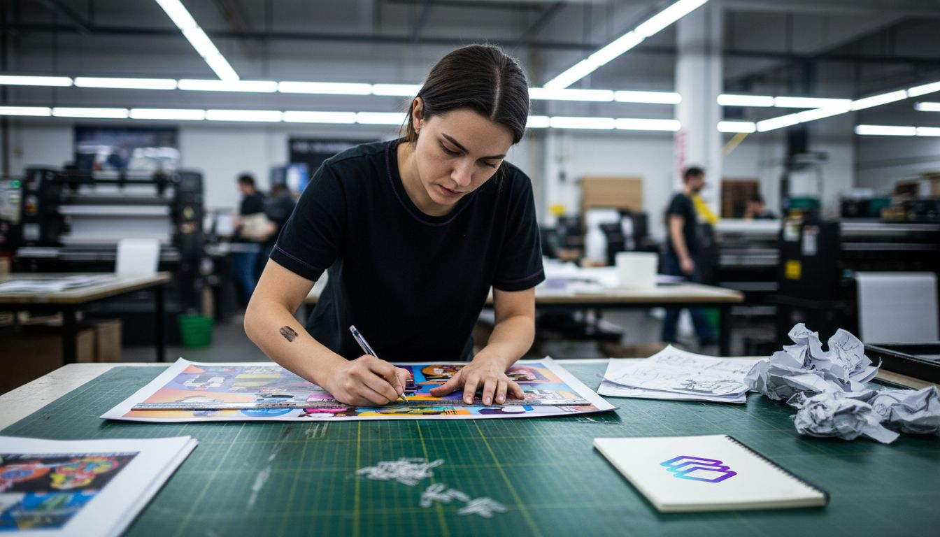
Misunderstood print terminology causes up to 35% of production delays in print shops, creating costly reworks and communication breakdowns. Mastering precise print design terms like bleed, DPI, and CMYK transforms your workflow, enabling clearer collaboration with print providers and more effective use of automation tools. This guide clarifies essential industry terminology to help you produce flawless print-ready files faster while reducing errors.
Table of Contents
- Introduction To Print Design Terminology
- Fundamental Print Design Terms Every Professional Must Know
- Color Models And Separation In Print Production
- Resolution, File Formats, And Automation Compatibility
- Common Misconceptions In Print Terminology And Their Impact
- Print Workflow Automation And The Role Of Industry Terms
- Practical Framework For Applying Print Terminology Knowledge
- Summary And Next Steps For Print Professionals
- Discover LayerPrep: Streamline Your Print Design Workflow
Key takeaways
| Point | Details |
|---|---|
| Precise terminology prevents errors | Understanding bleed, DPI, and color models eliminates costly print mistakes and reworks. |
| Color knowledge drives automation | CMYK and Pantone mastery enables AI tools to achieve 70-95% accurate color separation. |
| Resolution impacts quality | Using 300 DPI resolution ensures sharp, professional print output. |
| Clear specs streamline workflows | Consistent terminology improves communication between designers, print shops, and automation systems. |
Introduction to print design terminology
Precise print terminology creates the foundation for error-free production and efficient workflows. When designers and print professionals speak the same language, misunderstandings disappear and projects move smoothly from concept to finished product. This shared vocabulary becomes especially critical when working with automation tools that rely on exact specifications.
Mastering these terms delivers immediate benefits:
- Reduces expensive reworks from specification mismatches
- Accelerates file approval processes with print providers
- Enables confident use of AI-powered preparation tools
- Improves quality consistency across all print projects
Automation tools need precise definitions for file prep to function correctly. When you specify "300 DPI" or "0.125-inch bleed," automated systems can validate and prepare files without human intervention. This precision saves hours of manual checking and correction.
Print shops receive hundreds of files weekly. Clear terminology in your specifications tells them exactly what you need, reducing back-and-forth communication. A printing glossary provides standardized definitions that bridge designer intent with production reality.
Pro Tip: Create a quick reference sheet of your most-used print terms with exact specifications. Keep it visible during design work to maintain consistency and catch potential issues before file submission.
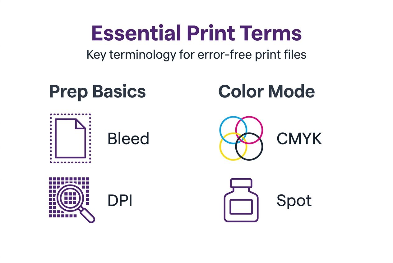
Fundamental print design terms every professional must know
Four core terms form the backbone of professional print preparation. Understanding these concepts prevents the most common production errors and ensures your files meet industry standards every time.
Bleed extends your design 0.125 inches beyond trim lines to prevent white edges after cutting. Commercial printers can't cut with perfect precision, so this extra margin compensates for slight variations. Without proper bleed, your finished pieces may show unprinted borders along edges.
Trim marks indicate where the printer will cut your final piece. The trim size represents your finished dimensions, while the bleed area extends beyond these marks. This relationship between trim and bleed ensures professional results regardless of minor cutting variances.
DPI (dots per inch) measures image resolution and directly impacts print clarity. Professional prints require 300 DPI minimum for sharp, detailed output. Lower resolutions create pixelated, blurry results that compromise your work's professional appearance.
- Screen displays use 72 DPI and look sharp on monitors
- Print production demands 300 DPI or higher for quality
- Large format prints may use lower DPI due to viewing distance
- Vector graphics maintain quality at any size without DPI concerns
CMYK (cyan, magenta, yellow, black) represents the four-color process used in commercial printing. This color model differs fundamentally from RGB (red, green, blue) used for screens. Converting RGB designs to CMYK often shifts colors, so designing in CMYK from the start maintains color accuracy.
Artwork refers to your finalized design files prepared according to print specifications. Professional artwork includes proper bleed, correct color mode, appropriate resolution, and accurate trim marks. Understanding the digital artwork print process ensures your files meet these standards before submission.
These terms interconnect to create print-ready specifications. A complete file specification might read: "8.5 x 11 inch trim, 0.125 inch bleed, CMYK color, 300 DPI, PDF format." This precise language eliminates guesswork and ensures your print layers separate correctly for production.
Color models and separation in print production
Color systems form the technical foundation of print reproduction. Two primary models dominate professional printing, each serving distinct purposes and offering specific advantages for different project types.
CMYK process printing combines four transparent inks in varying percentages to reproduce thousands of colors. This subtractive color model works by absorbing light wavelengths, with each ink layer removing specific colors from white paper. Full-color photographs, gradients, and complex artwork typically use CMYK for cost-effective reproduction.
Pantone spot colors provide precise, consistent color matching through premixed inks. Brands use spot colors to ensure their signature hues appear identical across all printed materials. A Pantone spot color prints as a single ink layer rather than combining multiple process colors, delivering more vibrant results for specific hues.
| Feature | CMYK Process | Pantone Spot |
|---|---|---|
| Color range | Thousands of combinations | Specific premixed colors |
| Ink layers | Four separate plates | One plate per color |
| Best for | Full-color images, photos | Brand colors, logos |
| Cost factor | Economical for multicolor | Cost-effective for limited colors |
| Consistency | Slight variations possible | Exact color matching |
Color separation divides artwork into individual printable layers, one for each ink color. In CMYK printing, separation creates four distinct layers. Spot color designs separate into unique layers for each Pantone ink. This process enables printers to create the individual plates or screens needed for production.
Automation technology now handles color separation with impressive accuracy. LayerPrep's color separation achieves 70-95% accuracy in matching and separating colors, dramatically reducing manual preparation time. These tools analyze your artwork, identify colors, and generate proper separation files in seconds.
Pro Tip: When combining spot and process colors in one design, clearly specify which elements use Pantone inks versus CMYK. This prevents confusion during separation and ensures your spot colors maintain their exact specifications while process colors reproduce correctly.
Resolution, file formats, and automation compatibility
Technical specifications determine how smoothly your files process through automated preparation systems. Format choices and resolution settings directly impact both final print quality and processing efficiency.
Common file formats serve different purposes in print production:
- PDF preserves complex layouts, fonts, and vector elements reliably
- PNG supports transparency and works well for simple graphics
- JPG compresses images efficiently but doesn't support transparency
- SVG maintains vector scalability for logos and illustrations
PDF format dominates professional printing because it embeds fonts, maintains color profiles, and preserves vector artwork. This format ensures your design appears identical on any system without requiring original fonts or linked images. Most automated tools prefer PDF input for its reliability and completeness.
| Format | Max Size | Best Use | Automation Support |
|---|---|---|---|
| 50MB+ | Complex layouts | Excellent | |
| PNG | 50MB | Graphics with transparency | Very good |
| JPG | 25MB | Photographs | Good |
| SVG | 10MB | Vector logos | Excellent |
Resolution directly correlates with file size and processing time. A 300 DPI image at 8.5 x 11 inches creates a much larger file than the same dimensions at 150 DPI. Automation systems handle larger files but may require additional processing time for complex, high-resolution artwork.
File size limits affect workflow efficiency. Most automated platforms accept files up to 50MB, accommodating professional print specifications while maintaining reasonable processing speeds. Extremely large files may need compression or optimization before upload, balancing quality with practical handling.
Understanding the digital artwork print process helps you choose optimal formats and settings. Vector elements maintain quality at any size without increasing file size significantly. Raster images scale resolution based on dimensions, creating larger files as size or DPI increases.
Color mode selection also impacts file compatibility. CMYK files sometimes appear duller on screen because monitors display RGB, but they print accurately. RGB files may need conversion before printing, potentially shifting colors unexpectedly. Starting in CMYK avoids these surprises.
Common misconceptions in print terminology and their impact
Misunderstandings about print specifications create preventable errors that compromise quality and waste resources. Recognizing these misconceptions helps you avoid costly mistakes and produce consistently professional results.
Bleed misconceptions cause frequent production problems. Many designers assume bleed is optional or that printers can work around missing bleed. In reality, skipping bleed guarantees white edges on trimmed pieces when cutting variations occur. Every printed piece requiring cutting needs proper bleed extension.
DPI confusion spans both understanding and application. Some believe DPI only matters for screen display, not print output. Others think higher DPI always produces better results regardless of context. In reality, 300 DPI serves as the professional standard because human eyes can't perceive additional detail in typical viewing conditions.
- Using 72 DPI for print creates blurry, pixelated output
- Excessive DPI like 1200 increases file size without visible quality gain
- DPI requirements vary based on viewing distance and print method
- Vector graphics bypass DPI limitations entirely
Grain direction affects folding and binding quality significantly. Folding against the grain causes cracks, misaligned creases, and unprofessional appearance. Paper fibers align in one direction during manufacturing, and folding parallel to these fibers produces clean, crisp results.
Creep impacts multi-page documents in ways many designers overlook. As pages stack inside a saddle-stitched booklet, inner pages appear to creep outward from the spine. This physical reality requires adjusting margins and positioning elements differently on inner versus outer pages to maintain consistent appearance.
Color mode assumptions create unpleasant surprises at print time. Designers sometimes believe RGB and CMYK produce identical results or that conversion happens automatically without color shifts. Converting RGB to CMYK always changes colors to some degree, with vibrant RGB hues often becoming duller in CMYK reproduction.
Understanding proper specifications for print layers prevents these issues before they reach production. Prevention costs nothing, while fixing printed errors wastes time, materials, and money.
Print workflow automation and the role of industry terms
Automation transforms print preparation from tedious manual work into streamlined digital processes. This efficiency gain depends entirely on precise terminology and specifications that machines can interpret and execute accurately.
AI-powered tools rely on exact parameters like bleed measurements, DPI thresholds, and color specifications to validate and prepare files. When you specify "0.125 inch bleed," the system checks your file against this exact standard. Vague instructions or non-standard terminology confuses automated systems and requires manual intervention.
Modern automation achieves impressive speed and accuracy:
- Upload your design file to the automation platform
- System analyzes artwork for color composition and specifications
- AI separates colors into individual printable layers
- Automated checks verify DPI, bleed, and technical requirements
- Platform generates print-ready files in approximately 30 seconds
This rapid turnaround eliminates hours of manual color separation and specification checking. Tools like LayerPrep's AI design separator handle complex artwork including gradients, multiple spot colors, and mixed color modes with minimal human oversight.
Clear terminology reduces post-automation corrections significantly. When your original specifications match industry standards, automated output requires little to no adjustment. Inconsistent or non-standard terms force manual review and correction, negating automation's time-saving benefits.
Communication between designers and automation systems improves with precise vocabulary. Instead of describing what you want in general terms, exact specifications enable direct machine execution. This precision mirrors how effective communication with human print technicians relies on shared technical language.
Pro Tip: Before automating your workflow, audit your current specifications for precision and completeness. Replace vague descriptions with exact measurements and standard terminology to maximize automation accuracy and minimize manual corrections.
Practical framework for applying print terminology knowledge
Transforming terminology knowledge into consistent workflow practices requires structured approaches. This framework helps you apply industry terms effectively while catching potential issues before they become expensive problems.
Create a pre-submission checklist covering essential specifications:
- Verify bleed extends 0.125 inches beyond trim on all sides
- Confirm resolution meets 300 DPI minimum for raster elements
- Check color mode matches printing method (CMYK or spot)
- Validate file format compatibility with production requirements
- Review that trim marks appear correctly positioned
- Ensure fonts are embedded or outlined properly
Match your file specifications to the intended printing method. Screen printing requires separated spot color layers, while digital printing works with CMYK process files. DTF printing accepts full-color designs but benefits from proper resolution and color separation. Understanding these connections prevents format mismatches.
Communicate specifications clearly using standard industry terminology. When submitting files to print providers or automation platforms, include complete technical details. A proper specification sheet lists trim size, bleed, color mode, resolution, and any special requirements using precise measurements and accepted terms.
Document your workflow standards for consistency across projects. Create templates with proper bleed, correct color profiles, and appropriate resolution settings. This standardization ensures every project starts with correct specifications rather than requiring manual setup each time.
Regularly update your terminology knowledge as print technology evolves. New printing methods, updated industry standards, and emerging automation capabilities require corresponding vocabulary. Following industry publications and print technology resources keeps your knowledge current and relevant for 2026 workflows.
Pro Tip: Build relationships with your print providers and ask questions about their specific requirements. Each shop may have slight variations in preferred specifications, and understanding these preferences improves results while strengthening professional partnerships.
The digital artwork print checklist provides a comprehensive starting point for developing your own quality control processes. Adapt these guidelines to your specific workflow and printing methods for optimal results.
Summary and next steps for print professionals
Mastering print design terminology creates the foundation for professional success in 2026's increasingly automated production environment. These precise terms enable clear communication with print providers, ensure technical specifications meet industry standards, and allow effective use of AI-powered preparation tools.
Terminology knowledge directly impacts project outcomes. Understanding bleed prevents white edges, proper DPI ensures sharp prints, and correct color modes maintain accurate reproduction. These basics form non-negotiable requirements for professional print production.
Automation amplifies the importance of precise vocabulary. AI tools execute instructions based on exact specifications, making clear terminology essential for leveraging these efficiency gains. As print technology continues advancing, professionals who master industry language position themselves to adopt new tools and methods confidently.
Continuing education keeps your skills relevant and competitive. Print technology evolves constantly, introducing new methods, updated standards, and emerging best practices. Staying current with terminology and specifications ensures you remain valuable to clients and employers.
Take immediate action by reviewing your current project specifications against industry standards. Identify gaps in your terminology knowledge and commit to learning proper definitions and applications. This investment pays dividends through improved quality, faster workflows, and fewer costly errors.
Discover LayerPrep: streamline your print design workflow
Applying print terminology knowledge becomes dramatically easier with purpose-built automation tools. LayerPrep's AI color separator transforms complex manual preparation tasks into automated processes that complete in seconds, not hours.
The platform analyzes your artwork and automatically separates colors into print-ready layers with 70-95% accuracy. This precision matches or exceeds manual separation while eliminating tedious work. Whether you're preparing files for screen printing, DTF, or other methods, LayerPrep handles the technical execution based on proper print specifications.
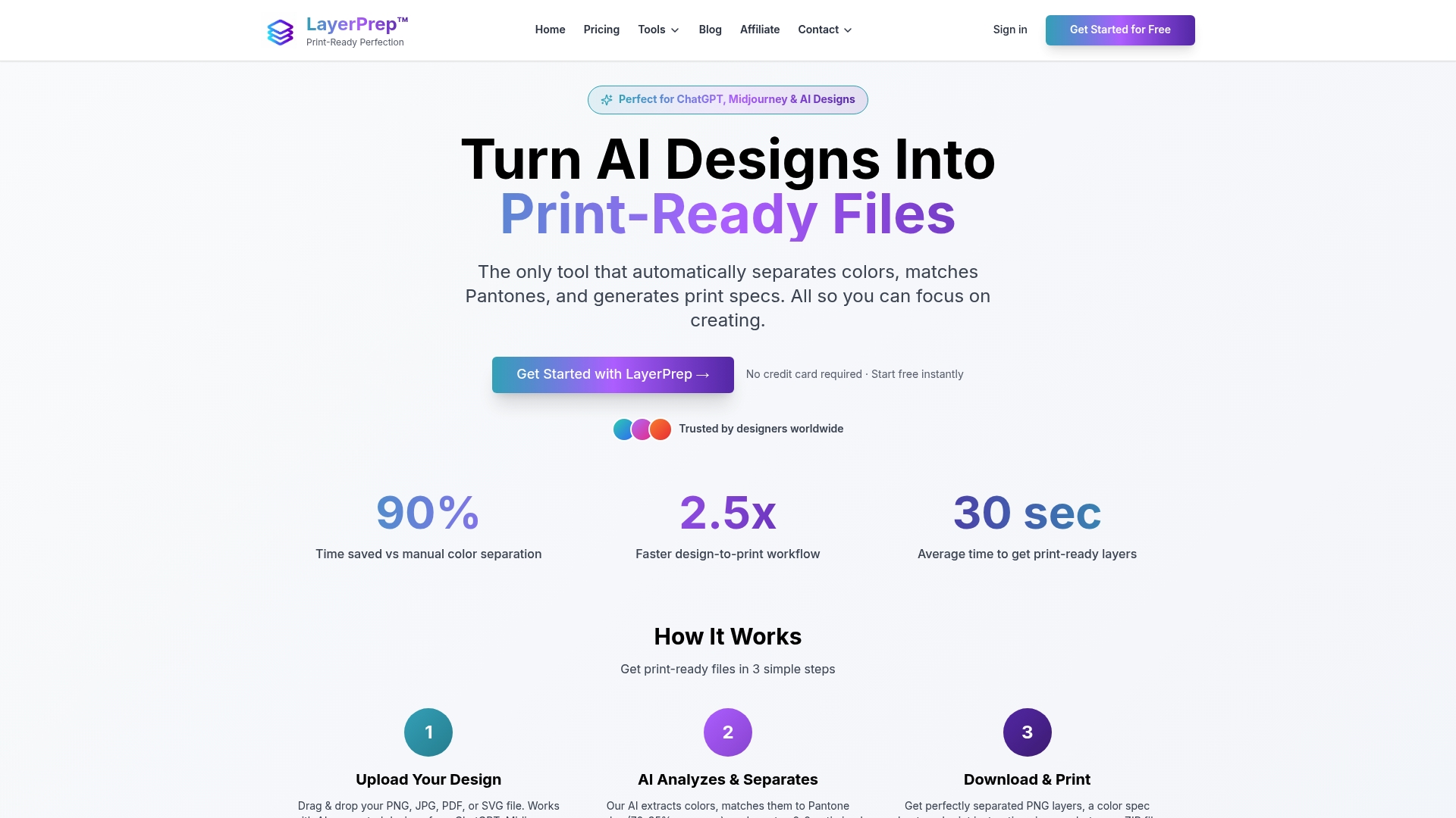
LayerPrep validates critical specifications automatically, checking DPI resolution, bleed requirements, and color accuracy. This built-in quality control catches issues before production, preventing expensive reworks. The system accepts various file formats up to 50MB and processes even complex designs with gradients and multiple colors efficiently.
Designers and print shops using LayerPrep's screen print tool report significant time savings and improved consistency. Average file preparation time drops from 30-60 minutes to approximately 30 seconds per design. This efficiency allows you to handle more projects while maintaining quality standards.
FAQ
What is bleed in print design and why is it essential?
Bleed extends your design 0.125 inches beyond final trim lines to prevent white edges after cutting. Commercial cutting equipment has slight variations, and bleed compensates for these natural inconsistencies to ensure your design reaches the edge.
How does DPI affect the quality of printed images?
Higher DPI creates more detailed, sharper prints by increasing pixel density per inch. Professional printing requires 300 DPI minimum because lower resolutions produce visible pixelation and blurriness that compromise quality.
Why is understanding color separation important for print automation?
Color separation divides artwork into individual printable layers for each ink color. Automation tools use these separations to generate print-ready files quickly, with AI achieving 70-95% accuracy when proper color specifications guide the process.
What common mistakes occur from misinterpreting against the grain in print?
Folding paper against its grain direction causes cracked creases, misaligned folds, and unprofessional appearance. Proper grain alignment ensures clean folds because paper fibers bend naturally rather than breaking.
How can automation tools like LayerPrep improve print file preparation?
LayerPrep automates color separation and specification checking, reducing preparation time from 30-60 minutes to approximately 30 seconds. The platform enforces print standards automatically, catching errors before production and maintaining consistent quality across all files.