You've spent hours perfecting a gradient design, only to see harsh banding ruin the print. This frustrating issue confuses even experienced designers who wonder why smooth digital transitions turn into visible steps on paper. Understanding gradients' critical role in print production and learning proven optimization techniques can transform your workflow. This guide explains why banding happens, how color choices affect gradient quality, and practical methods to achieve flawless printed gradients every time.
Table of Contents
- Understanding Gradients And Banding In Print Design
- Why Cmyk Mode And Color Choices Matter For Gradients
- Practical Workarounds To Minimize Banding In Print Gradients
- Implementing Gradients For Efficient Print Workflows
- Enhance Your Print Design With Advanced Color Separation Tools
- Frequently Asked Questions
Key takeaways
| Point | Details |
|---|---|
| Banding varies by device | Gradient stepping appears differently on monitors versus printed output due to resolution limitations |
| CMYK reduces banding | Mixing all four color components creates smoother transitions than single-channel gradients |
| Short gradients work better | Limiting gradient distance and increasing contrast minimizes visible banding patterns |
| Reflex Blue myth debunked | Pantone Reflex Blue does not inherently cause digital print banding issues |
| Workflow optimization matters | Strategic gradient preparation enhances print quality and production efficiency |
Understanding gradients and banding in print design
Gradients are color transitions that blend two or more hues smoothly across a defined space. Print designers work with several gradient types including linear (straight-line transitions), radial (circular patterns emanating from a center point), and shape blends (morphing between vector objects). Each type serves different visual purposes but shares common print challenges.
Banding is a common issue in gradients, especially in vector programs like Adobe Illustrator, appearing as visible steps rather than smooth color flow. This stepping effect occurs when the color transition lacks sufficient incremental values to create a seamless blend. The result looks like distinct color bands stacked together instead of a continuous fade.
What makes banding particularly confusing is that it's device resolution dependent, meaning your monitor might show different banding patterns than the final print. A gradient appearing smooth on screen can reveal obvious steps when printed, or vice versa. This discrepancy happens because monitors and printers process color information differently, using distinct resolution capabilities and color reproduction methods.
Banding challenges stem from the fundamental difference between how digital displays and physical printers render continuous color transitions, making preview accuracy critical for print success.
Vector software like Illustrator often amplifies banding visibility because it calculates gradients mathematically rather than pixel by pixel. When you streamline your digital artwork print process, understanding these technical limitations helps you anticipate and prevent output problems. Common gradient issues in print include:
- Posterization where smooth transitions become distinct color zones
- Inconsistent banding patterns across different print technologies
- Color shifts between digital preview and physical output
- Moire patterns when gradients interact with halftone screens
- Loss of subtle tonal variations in compressed file formats
These visual artifacts compromise design quality and create rework cycles that slow production. Recognizing how gradients behave differently across devices helps you make informed design decisions early. Learning master print design terms provides additional context for communicating gradient specifications with print vendors and understanding their technical feedback about file preparation requirements.
Why CMYK mode and color choices matter for gradients
Color mode selection fundamentally impacts gradient smoothness in print production. RGB (Red, Green, Blue) works for screens using additive light mixing, while CMYK (Cyan, Magenta, Yellow, Black) represents subtractive ink mixing on paper. Print designers must work in CMYK to accurately preview how inks will interact and blend.

Using CMYK color mode can reduce banding in specific color combinations by distributing tonal transitions across multiple ink channels. When you create a gradient using colors that engage all four CMYK components, the printer has more incremental steps to work with. A gradient from cyan to magenta that also shifts yellow and black values creates a richer transition path than one changing only a single color channel.
Consider these gradient examples. A poor choice might fade from 100% cyan to 0% cyan with no other color changes, creating a single-channel transition prone to banding. A better approach blends from C100/M20/Y10/K0 to C0/M80/Y30/K5, engaging multiple channels for smoother results. This multi-channel strategy gives the printer more data points to interpolate, reducing visible steps.
Color relationships also affect perceived smoothness. Gradients between analogous colors (neighbors on the color wheel) typically print more smoothly than complementary color blends. Transitioning from blue to purple works better than blue to orange because the former requires less dramatic ink shifts. Understanding these relationships helps you choose gradient endpoints that minimize banding risk.
Pro Tip: Always enable CMYK preview mode in your design software before finalizing gradients, then zoom to 200% or 300% to inspect for banding patterns that might not appear at normal view scale.
The impact on color accuracy in print design extends beyond banding reduction. CMYK mode helps you avoid out-of-gamut colors that look vibrant on screen but print muddy or shifted. When you design gradients in RGB then convert to CMYK late in the process, you risk discovering that your carefully crafted transitions no longer work because the colors shifted during conversion.
Working in CMYK from the start lets you make informed decisions about achievable color ranges. You can test gradient combinations knowing they represent actual ink capabilities rather than theoretical screen colors. This proactive approach prevents surprises during production and reduces the need for last-minute design adjustments.
Testing gradients through your digital artwork print process tips workflow ensures consistency. Print test swatches on your target substrate using the actual printing method planned for final production. Different papers and printing technologies render gradients with varying smoothness levels, so physical testing reveals real-world performance better than any screen preview.
Practical workarounds to minimize banding in print gradients
Several tactical design strategies help you create gradients that print cleanly without visible banding. These workarounds include using short distance gradients, increasing contrast, and choosing colors strategically. Implementing these techniques requires no special software, just thoughtful design decisions.
Short gradients work better than long fades because they compress color transitions into smaller spaces, making individual steps less perceptible. Instead of fading across an entire 11-inch page width, limit your gradient to 2 or 3 inches. If your design requires larger gradient areas, consider using multiple short gradients or adding textural elements that disguise banding.
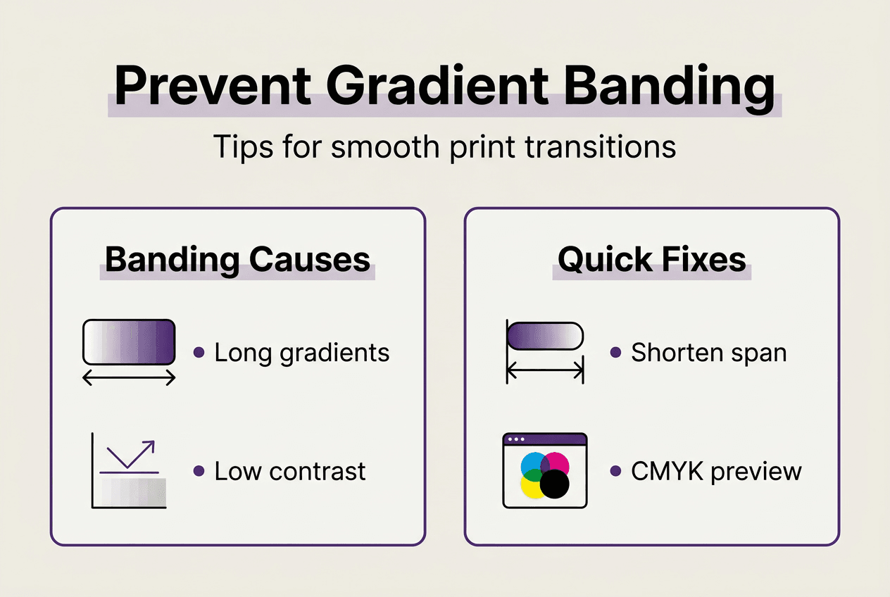
Increasing contrast between gradient endpoints also reduces banding visibility. A subtle fade from light gray to white shows every tiny step, while a bold transition from deep purple to bright yellow provides enough visual interest that minor banding becomes imperceptible. Higher contrast gives viewers' eyes more dramatic information to process, effectively camouflaging technical limitations.
Color selection matters more than many designers realize. While some colors naturally band more than others due to their CMYK composition, the myth of Pantone Reflex Blue as cursed for banding doesn't hold in digital printing. This superstition originated with older printing technologies and specific ink formulations that are no longer relevant. Modern digital printing handles Reflex Blue gradients as well as most other colors.
Focus instead on these proven gradient optimization strategies:
- Use noise or texture overlays to break up banding patterns visually
- Add subtle grain effects that disguise color steps
- Incorporate design elements like patterns or illustrations that draw attention away from gradient areas
- Test gradients at actual print size rather than scaled views
- Avoid gradients that fade to pure white or solid black when possible
Pro Tip: Export gradient test files as high-resolution PDFs and view them in Adobe Acrobat's Output Preview mode with CMYK separation plates visible to see exactly how each ink channel contributes to the blend.
| Banding Cause | Suggested Fix |
|---|---|
| Long gradient distance | Shorten gradient span to under 3 inches |
| Single color channel fade | Engage multiple CMYK components |
| Low contrast transition | Increase color difference between endpoints |
| Pure white or black endpoint | Use near-white or near-black values instead |
| High compression | Export with minimal compression settings |
Understanding which printing methods for gradients work best helps you set realistic expectations. Offset printing typically handles gradients better than digital printing due to higher resolution capabilities, while screen printing struggles with gradients entirely. Knowing your production method's limitations lets you design accordingly.
When you optimize your print workflow, gradient preparation becomes a standard quality checkpoint rather than an afterthought. Build gradient testing into your approval process so clients see accurate representations before committing to full production runs. This proactive approach prevents costly reprints and maintains your reputation for quality output.
Implementing gradients for efficient print workflows
Thoughtful gradient implementation streamlines print file preparation and ensures consistent results across production runs. Optimized gradients reduce file processing time, minimize color matching issues, and prevent production delays caused by technical problems. Your workflow efficiency depends on systematic gradient handling from initial design through final output.
Gradient optimization directly impacts print readiness by reducing file complexity and improving RIP (Raster Image Processor) performance. Complex gradients with unnecessary anchor points or overlapping blend modes can slow processing and increase error risk. Simplifying gradient structures while maintaining visual quality keeps files lean and production-friendly.
Follow this workflow to prepare gradients for professional print production:
- Design all gradients in CMYK color mode from project start to ensure accurate color representation
- Limit gradient spans to necessary distances and avoid unnecessary long fades across large areas
- Test gradient smoothness by zooming to 200% and inspecting for visible banding patterns
- Add subtle noise or texture if needed to disguise minor banding without compromising design intent
- Flatten complex gradient layers when possible to reduce file size and processing demands
- Export using appropriate PDF settings with minimal compression on gradient areas
- Verify gradient appearance in soft proof mode before sending files to production
- Archive gradient specifications and settings for future projects requiring similar effects
Color separations become critical when gradients involve spot colors or special inks. Understanding how your gradient will separate into individual print plates helps you anticipate potential issues. A gradient blending two spot colors requires careful planning because it may need to convert to process colors or use specialized printing techniques.
Previewing print output with gradients requires more than standard screen proofing. Use calibrated monitors and soft proofing tools that simulate specific paper stocks and printing conditions. Physical proof prints remain the gold standard for gradient approval because they reveal exactly how inks will interact on your chosen substrate.
Linking gradient optimization with efficient print design workflows creates systematic quality control. When every team member understands gradient best practices, files move through production smoothly without technical holds or revision requests. This consistency reduces stress and improves delivery timelines.
Understanding what print layers are helps you organize gradient elements properly within your file structure. Keeping gradients on separate layers with clear naming conventions makes troubleshooting easier if problems arise. You can quickly isolate and adjust gradient layers without disrupting other design elements.
Your streamlined digital print process should include gradient-specific checkpoints at key stages. Before sending files to the printer, verify that all gradients use appropriate color modes, maintain reasonable complexity levels, and preview correctly in production conditions. These simple checks prevent most gradient-related production issues.
Enhance your print design with advanced color separation tools
Managing gradients and complex color work can slow your production workflow and introduce errors. LayerPrep automates the color separation process, handling gradients with precision while extracting Pantone colors at 70 to 95% accuracy. This AI-powered platform transforms your designs into print-ready files in about 30 seconds, supporting formats from PNG and JPG to PDF and SVG.
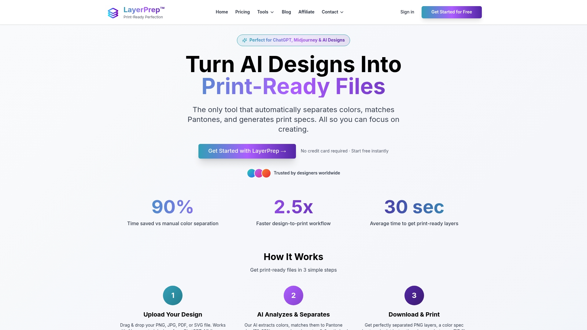
The tool validates DPI resolution and checks bleed specifications automatically, catching issues before they reach production. Whether you're working with AI-generated designs or traditional artwork, LayerPrep's color separator processes complex gradients and large files up to 50MB without compromising quality. This efficiency lets you focus on design creativity while the platform handles technical preparation, reducing manual effort and ensuring consistent color accuracy across all your print projects.
Frequently asked questions
What causes banding in printed gradients?
Banding results from insufficient color steps to create smooth transitions between gradient endpoints. Resolution limitations differ between monitors and printers, causing gradients to appear differently on screen versus paper. Printers have finite capabilities for reproducing continuous tone transitions, especially when gradients use single color channels or span large distances.
How can I reduce banding when designing gradients for print?
Implement short distance gradients with increased contrast and engage multiple CMYK color components rather than single-channel fades. Test gradients using CMYK preview mode at high zoom levels to spot potential issues. Adding subtle texture or noise can disguise minor banding without compromising your design intent.
Is Pantone Reflex Blue bad for gradients in print?
Pantone Reflex Blue does not inherently cause banding in modern digital printing. This myth originated with older printing technologies and specific ink formulations no longer in common use. Current digital printing systems handle Reflex Blue gradients as effectively as most other Pantone colors when proper design techniques are applied.
What software features help manage gradients for print?
CMYK preview mode lets you see how gradients will separate into print plates before finalizing designs. Many professional design applications include gradient mesh tools and banding simulation features. Print readiness validation tools check gradient complexity and flag potential production issues, streamlining your workflow and reducing revision cycles.