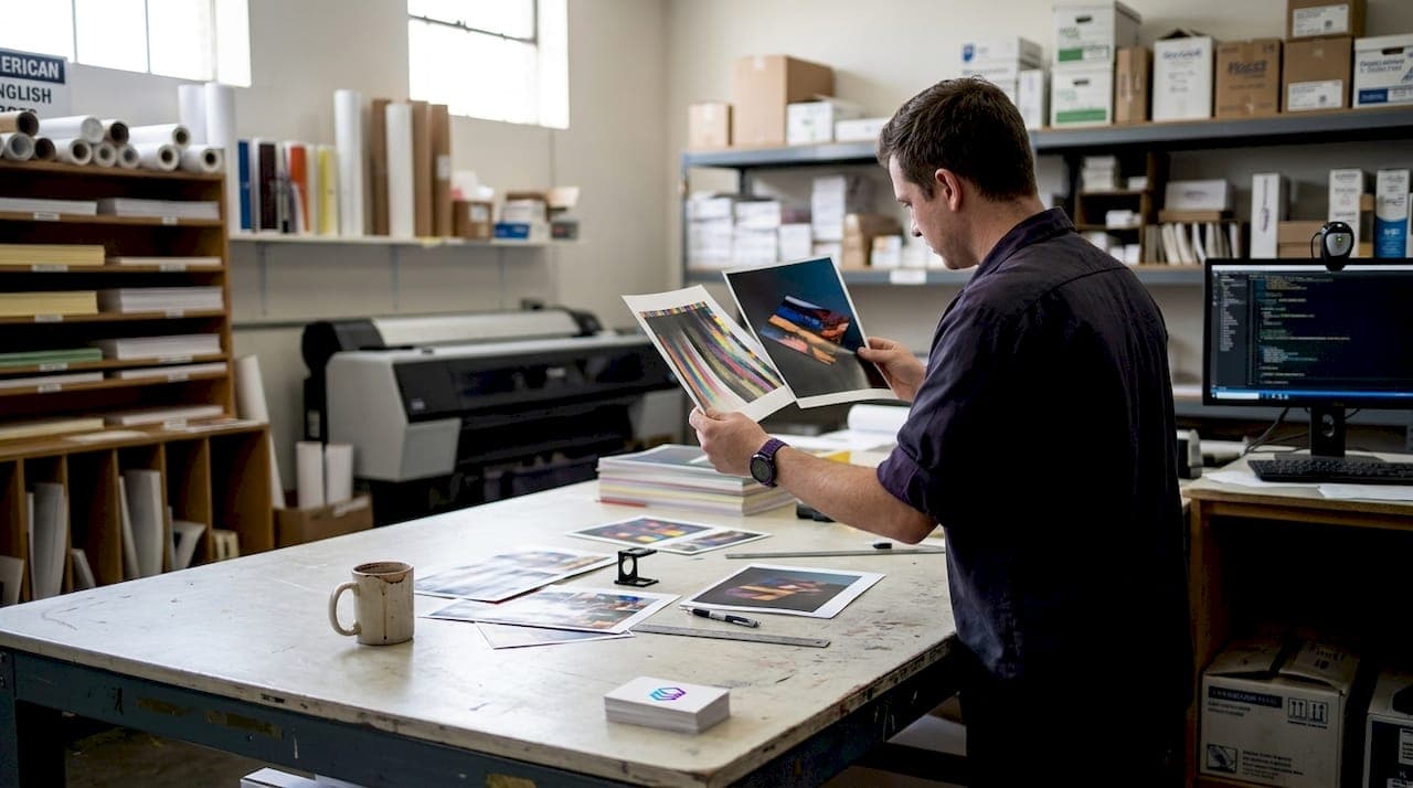
Color inconsistency is one of the most expensive problems in print production. A design looks perfect on screen, then comes off the press looking dull, shifted, or completely off-brand. That gap between what you see and what you get costs real money in reprints, wasted materials, and frustrated clients. Color profiles ensure consistency from screen to print, and understanding them is not just for color scientists. It is a practical skill every print shop owner and graphic designer needs. This guide breaks down what color profiles are, how to use them, and how to avoid the mistakes that lead to costly do-overs.
Table of Contents
- What are color profiles and how do they work?
- Types of color profiles in the print industry
- Creating and calibrating custom color profiles
- Working with color profiles in the digital-to-print workflow
- Rendering intents: How colors are interpreted and managed
- Key pitfalls and troubleshooting color profile issues
- Upgrade your workflow with better color management tools
- Frequently asked questions
Key Takeaways
| Point | Details |
|---|---|
| Profiles translate color | Color profiles ensure devices speak the same color language for consistent output. |
| Industry standards matter | Adopting the right profile for your print process prevents quality issues and miscommunication. |
| Custom beats generic | Investing in custom profiles delivers better color, fewer surprises, and less waste for professionals. |
| Workflow integration is crucial | Embedding, converting, and soft-proofing with ICC profiles throughout your workflow guarantees predictable prints. |
| Avoid common pitfalls | Be aware of ink limits, black handling, and double-profiling to maximize color accuracy and minimize errors. |
What are color profiles and how do they work?
Every device in your workflow sees color differently. Your monitor, your RIP software, and your press all speak different color languages. Color profiles are the translators. ICC profiles are data files that characterize how a specific device, such as a printer combined with ink and paper, reproduces colors, acting as translators between different color spaces like RGB and CMYK to ensure consistency from screen to print.
Without a profile, your print software is guessing. That guess is often wrong. Here are the core terms you need to know:
- ICC profile: A standardized data file that describes a device's color behavior
- Color space: A defined range of colors, such as RGB (used by screens) or CMYK (used by printers)
- Gamut: The total range of colors a device can reproduce
- Color rendering: How a device maps colors from one space to another
"Effective color management with profiles reduces reprints and waste, maintains brand consistency, and enables predictable proofing. Prioritize custom or device-specific profiles over generic ones."
Ignoring profiles leads to brand inconsistency, wasted substrates, and unhappy clients. Generic manufacturer profiles are a starting point, but they rarely match your exact press, ink, and paper combination. For precise color accuracy in production, custom profiles are the standard to aim for.
Types of color profiles in the print industry
Knowing what color profiles are, let's look at the industry standards and how they shape daily print decisions. Different markets and print technologies rely on different standard profiles. Using the wrong one for your region or press type is a common source of color drift.
Standard industry profiles include GRACoL (US sheetfed coated), SWOP (US web offset), and FOGRA/ISO Coated (Europe), each defining specific color gamuts, ink limits, and tone value increase for consistency across presses.
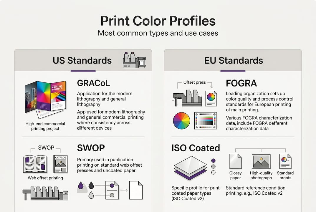
Here is a quick-reference comparison:
| Profile | Region/Market | Print method | Key attributes |
|---|---|---|---|
| GRACoL 2013 | North America | Sheetfed coated | Wide gamut, 300% ink limit |
| SWOP v2 | North America | Web offset | Moderate gamut, 300% ink limit |
| FOGRA51 | Europe | Sheetfed coated | ISO standard, 330% ink limit |
| FOGRA52 | Europe | Uncoated | Lower gamut, 300% ink limit |
Choosing the right profile matters for more than just color. It affects color conversion in print, ink coverage, drying time, and how your files communicate with trade printers. When you send a file to a commercial printer, they expect a specific profile. Sending a GRACoL file to a European printer expecting FOGRA51 can cause visible color shifts, even if the design looks identical on your screen.
Key reasons to use industry-standard profiles:
- Predictable results across different presses and facilities
- Easier communication with trade printers and clients
- Reliable soft proofing before committing to a press run
- Reduced risk of color disputes and reprints
Creating and calibrating custom color profiles
Industry standards are helpful, but nothing beats optimizing for your own press. Here is how you build a custom ICC profile and why it pays off.

Profile creation involves calibration to stabilize the device, followed by characterization, which means printing and measuring a color chart with a spectrophotometer to generate the profile.
Follow these steps:
- Calibrate your printer and monitor. Stabilize ink density, linearize the press, and set your monitor to a consistent white point (D50 for print work).
- Print a color target. Use a standard IT8 or ECI2002 target on your exact paper and ink combination.
- Measure the target. Use a spectrophotometer to capture how your device actually reproduces each color patch.
- Generate the ICC profile. Use profiling software to build the profile from your measurements and install it in your system.
- Verify accuracy. Print a verification target and measure Delta E00 values. Aim for an average below 2.0.
The results are worth the effort. Custom profiles outperform generic ones, with one test showing a custom profile achieving deeper d-max blacks and richer colors compared to a Canson generic profile.
| Metric | Generic profile | Custom profile |
|---|---|---|
| D-max black density | Lower | Deeper, richer |
| Gamut coverage | Narrower | Expanded |
| Average Delta E00 | 3.5 to 5.0 | Below 2.0 |
| Color shift risk | Higher | Minimal |
Pro Tip: Always use a custom profile for critical color projects, especially brand work, fine art reproduction, or packaging. The time investment in profiling pays back immediately in fewer reprints and stronger client confidence. For design validation for print, a verified custom profile is your most reliable tool.
Working with color profiles in the digital-to-print workflow
Armed with standards and a custom profile, let's put everything together in a practical workflow from computer to press.
Color profiles are used for soft proofing, color conversion during export or print, and embedding in files for print shops to interpret correctly.
Here is the recommended workflow sequence:
- Calibrate your monitor to D50 white point and 2.2 gamma
- Design in Adobe RGB (wider gamut than sRGB, better for print)
- Request your print shop's ICC profile before finalizing the file
- Soft proof in Photoshop or Illustrator using the printer's ICC
- Convert to CMYK using the target profile at export
- Embed the profile in your exported PDF or TIFF
Calibrate your monitor, use Adobe RGB, embed profiles, request the printer's profile, soft-proof, and avoid letting your printer driver manage color. Driver color management and application color management running simultaneously cause double profiling, which is one of the most common and damaging mistakes in print prep.
Common mistakes to avoid:
- Double profiling: Letting both your application and printer driver apply color management at the same time
- Missing profile embed: Exporting without embedding the ICC profile, leaving interpretation up to the print shop
- Wrong color space for the job: Sending sRGB files to a press expecting Adobe RGB or CMYK
- Skipping soft proof: Approving a file without previewing it in the target ICC
Pro Tip: Always soft-proof your files in the target ICC before sending to print. What looks vibrant on your monitor may appear flat on uncoated stock. Soft proofing takes two minutes and can save you an entire press run. Managing design files for print workflows starts with getting the profile step right.
Rendering intents: How colors are interpreted and managed
With a workflow in place, it is vital to address how profiles handle challenging colors. Rendering intents control what happens when a color in your design falls outside the gamut of your printer.
Rendering intents handle out-of-gamut colors in four distinct ways, each suited to different scenarios:
- Perceptual: Compresses the entire gamut proportionally. Best for photos and images with smooth gradients. Colors shift slightly but relationships between them are preserved.
- Relative Colorimetric with Black Point Compensation (BPC): Keeps in-gamut colors accurate and clips out-of-gamut colors to the nearest edge. This is the default choice for coated CMYK work.
- Absolute Colorimetric: No white point adaptation. Used specifically for proofing, when you want to simulate one press on another.
- Saturation: Maximizes color vividness. Best for charts, graphics, and presentations where accuracy matters less than impact.
For most commercial print jobs, Relative Colorimetric with BPC is the right call. For photography or fine art on uncoated stock, Perceptual often produces more natural results.
Pro Tip: When working on important images, soft-proof with both Perceptual and Relative Colorimetric intents side by side. The difference can be significant, especially in shadow areas and saturated reds. Avoiding design mistakes in printing means testing your intent before committing to output.
Key pitfalls and troubleshooting color profile issues
By now, you are set up for success. But these classic mistakes still trip up experienced professionals, and they are worth knowing before they cost you a press run.
Common color profile pitfalls:
- Double profiling: Applying ICC conversion in both your design app and the RIP. The result is a color-shifted, unpredictable output.
- Ignoring ink limits: Every profile has a total ink coverage limit. Exceeding it causes drying problems, ink bleeding, and muddy shadows.
- Wrong black type for small text: Small text and fine lines should use single K black to avoid fringing from misregistration of multiple ink channels.
- Not testing your substrate: A profile built for coated stock will produce inaccurate results on uncoated or textured paper.
- Converting RGB to CMYK too early for photos: Convert RGB to CMYK early for solids and logos, but keep photos in RGB until output if you are soft-proofing against the target profile.
Proper color profile management directly reduces material waste, reprints, and client disputes. Shops that implement device-specific profiles and verify with Delta E00 measurements consistently report fewer color-related press stops and stronger client retention.
If you run into color issues, start by checking whether the correct profile is embedded, whether double profiling is occurring, and whether your ink limits are within spec. Most color problems trace back to one of these three sources. A solid print-ready artwork checklist will catch these before they reach the press.
Upgrade your workflow with better color management tools
Color profile management is only one part of a reliable print workflow. Getting files truly print-ready, with correct color separation, validated DPI, and accurate Pantone matching, requires tools that work as fast as your production schedule demands.
LayerPrep's color management solutions are built specifically for print shops and graphic designers who need speed and accuracy without the manual overhead. LayerPrep automates color separation, matches Pantone colors with 70 to 95% accuracy, validates DPI, and checks bleed specs, all in an average of 30 seconds. Whether you are working with PNG, JPG, PDF, or SVG files, including AI-generated artwork from Midjourney or ChatGPT, LayerPrep produces print-ready layers for screen printing, DTF, and more. Fewer reprints, faster turnaround, and more confidence in every file you send to press.
Frequently asked questions
What is the main benefit of using color profiles in printing?
Color profiles reduce reprints and waste, maintain brand consistency, and enable predictable proofing from digital file to final print. They remove the guesswork from color reproduction.
Do I need a different color profile for each printer or paper type?
Yes. Custom profiles for each printer-paper-ink combo outperform generic manufacturer profiles and deliver the most accurate, consistent results for your specific setup.
Which rendering intent should I choose for my print job?
Use Relative Colorimetric with BPC for most coated CMYK work, and Perceptual for photos or uncoated stock. Test rendering intents via soft-proofing for images before committing to output.
What happens if I skip embedding a color profile when exporting artwork?
Color profiles embedded in files tell the print shop how to interpret your colors correctly. Without an embedded profile, the shop may apply a default that causes unwanted color shifts or flat, dull output.
How accurate should my verification measurements be?
Aim for an average Delta E00 below 2, with critical colors under 1.5. These benchmarks indicate a profile that will deliver reliable, high-quality color matching across your press runs.