
Color separation is the backbone of accurate, professional printing. Whether you're preparing screen prints, DTF transfers, or offset jobs, mistakes in separating colors lead to expensive reprints, wasted materials, and frustrated clients. This guide walks you through efficient techniques for color separation in printing, covering preparation, execution, expert tips, and verification. You'll learn how to balance manual precision with automated tools, avoid common pitfalls, and deliver print-ready files that meet exacting standards every time.
Table of Contents
- Key takeaways
- Preparing your artwork for color separation
- Step-by-step methods for separating colors in printing
- Expert tips and common pitfalls in color separation
- Verifying and testing color separations before printing
- Improve your print production workflow with LayerPrep
- FAQ
Key Takeaways
| Point | Details |
|---|---|
| Convert to CMYK early | Convert your artwork to CMYK mode upfront and embed color profiles that match your printer and substrate to prevent color shifts when files move between software and devices. |
| High DPI and vectors | Set resolution between 300 and 600 DPI based on the level of detail and use vector artwork whenever possible for scalable, clean separations. |
| Organize layers effectively | Divide design elements into logical layers with transparent backgrounds to speed color isolation and reduce stray elements in a separation. |
| Bleed and trim checks | Verify bleed and trim marks are correctly positioned to ensure accurate alignment during printing. |
| Test proofs before printing | Test proofs to verify separation accuracy and catch issues before going to press, reducing rework. |
Preparing your artwork for color separation
Before you separate a single color, your artwork must be properly configured. Poor preparation causes separation failures, color shifts, and resolution problems that surface only after printing begins. Start by converting your design to CMYK color mode early in the process, and embed color profiles that match your printer and substrate. This prevents unexpected color shifts when files move between software and devices.
Resolution directly impacts separation quality. Set your artwork between 300 and 600 DPI depending on the level of detail. Simple designs with bold shapes work fine at 300 DPI, but intricate text or fine linework demands 600 DPI to maintain sharpness. Vector artwork offers the best results because it scales without losing quality and produces clean edges that separate cleanly. When working with raster images, ensure they're high resolution from the start, as upscaling later introduces artifacts.
Layer organization matters more than most designers realize. Separate your design elements into logical layers with transparent backgrounds where appropriate. This makes isolating individual colors faster and reduces the chance of accidentally including unwanted elements in a separation. Avoid anti-aliasing on vector edges, as the soft transitions create messy separations with fuzzy borders. You can streamline digital artwork print process by establishing consistent file setup habits.
Key preparation checklist:
- Convert to CMYK mode and embed appropriate color profiles
- Set resolution to 300-600 DPI based on design complexity
- Use vector artwork whenever possible for scalability
- Organize layers with transparent backgrounds
- Disable anti-aliasing on vector edges to prevent blur
- Verify bleed and trim marks are correctly positioned
Proper preparation eliminates 80% of separation problems before they occur. Investing time here pays off with faster, more accurate separations and fewer production headaches. Once your artwork is properly configured, you can move confidently into the actual separation process. Understanding efficient print design workflows helps you build these preparation steps into your standard operating procedures.
Step-by-step methods for separating colors in printing
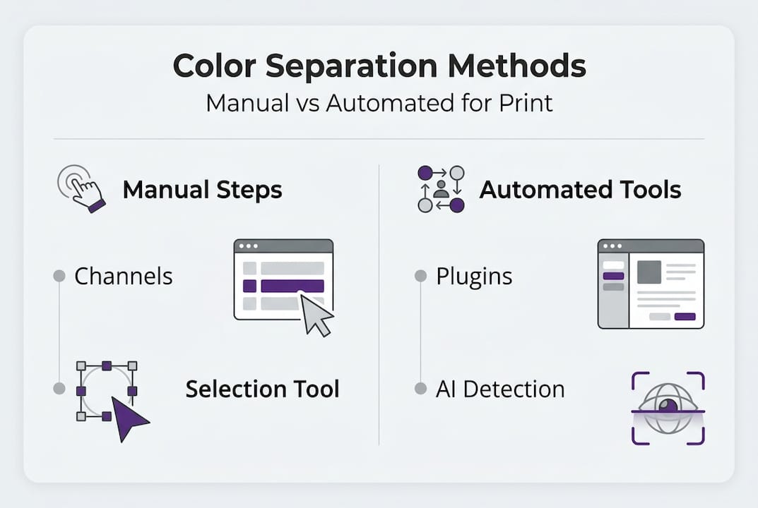
Color separation can be executed manually using software controls or automated with specialized plugins and tools. Each approach has distinct advantages depending on your workflow, design complexity, and production volume. Manual separation gives you maximum control over tonal adjustments and color isolation, while automation speeds up repetitive tasks for high-volume shops.
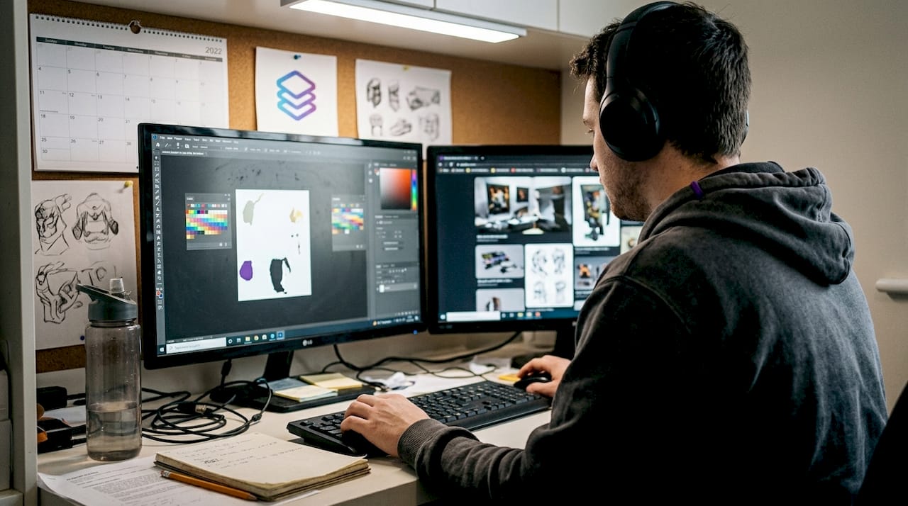
Manual separation in Photoshop relies on the Channels panel to isolate individual colors. Open your CMYK file and examine each channel (cyan, magenta, yellow, black) separately to see how colors distribute. Use the Color Range selection tool to isolate specific hues, then refine selections with Curves adjustments to control tonal values. This method works exceptionally well for spot color designs where you need to extract a specific Pantone color onto its own layer. Create a new layer for each separated color, filling selections with solid black on a transparent background to generate your print-ready separations.
Automated separation software like T-Seps, Separation Studio, or UltraSeps accelerates the process by analyzing your artwork and generating separations based on preset rules. These tools excel at handling complex photographic images with gradients and tonal variations. However, automated software often requires manual tweaking to achieve optimal results. You'll typically need to adjust underbase layers, refine edge detail, and verify color accuracy after the initial automated pass.
For designs combining spot colors and process colors, use a hybrid approach. Separate logos and solid brand colors onto dedicated spot layers to ensure precise color matching. Handle photographs and gradients with CMYK process separations using halftone screens. RIP (Raster Image Processor) software prepares halftone screens with consistent dot patterns, line screens, and angles that prevent moiré patterns during printing.
Step-by-step manual separation process:
- Open your CMYK file in Photoshop and duplicate the background layer
- Navigate to the Channels panel and examine each color channel individually
- Use Select > Color Range to isolate specific colors, adjusting fuzziness for precision
- Create a new layer and fill the selection with solid black on transparent background
- Repeat for each color in your design, naming layers clearly (cyan, magenta, spot red, etc.)
- Apply Curves adjustments to control tonal values and ink density
- Export each layer as a separate grayscale file for film output or direct-to-screen
Pro Tip: When separating spot colors for logos, use the Magic Wand tool with tolerance set to 5-10 to capture exact color boundaries without bleeding into adjacent areas. This creates cleaner separations with sharper edges.
The method you choose depends on your specific production needs. High-volume shops benefit from automated tools that process dozens of designs daily, while custom or specialty work often demands the precision of manual separation. Many professionals use a combination, automating routine separations while manually handling complex or high-value projects. Understanding various printing methods and techniques helps you select the separation approach that matches your production method.
Expert tips and common pitfalls in color separation
Even experienced print professionals encounter separation challenges that compromise print quality or waste materials. Understanding these pitfalls and applying expert techniques prevents costly errors and improves your separation accuracy significantly.
One critical technique involves choking underbase layers to prevent color bleed. When printing light colors over dark garments, the white underbase must be slightly smaller than the top colors. Choke underbases by 5-10 pixels to prevent white ink from peeking out around color edges. This subtle adjustment makes the difference between professional results and amateur mistakes that scream poor craftsmanship.
Anti-aliasing creates soft edges that look smooth on screen but separate poorly for printing. Those semi-transparent pixels along edges become problematic gray tones that print inconsistently. Disable anti-aliasing on vector artwork and use hard-edged selections when isolating colors. If you inherit a design with anti-aliasing already applied, use threshold adjustments to convert soft edges to hard boundaries before separating.
Resolution requirements vary based on design elements. While 300 DPI works for most applications, 600 DPI for small details like fine text or intricate linework prevents jagged edges and maintains clarity. The file size increase is worth the quality improvement for professional work. Balance resolution against practical file handling, as 600 DPI files for large format prints can become unwieldy.
Gray Component Replacement (GCR) is an underutilized technique that reduces ink usage by 15-25% while improving print stability. GCR replaces overlapping cyan, magenta, and yellow inks in shadow areas with black ink. This reduces ink costs, speeds drying times, and minimizes color shifts from registration errors. Apply GCR during CMYK conversion in Photoshop by selecting Maximum or Heavy GCR settings in the conversion dialog.
Transparent backgrounds are essential for proper separations, yet many designers forget to remove white backgrounds before separating. A white background layer prints as an unwanted color, wasting ink and creating opacity problems. Always verify that your design sits on a transparent background before beginning separation work.
Common pitfalls to avoid:
- Failing to choke underbase layers, causing white ink bleed
- Leaving anti-aliasing enabled on vector artwork
- Using insufficient resolution for fine details and small text
- Ignoring GCR settings, resulting in excessive ink usage
- Separating designs with opaque white backgrounds instead of transparent
- Mixing RGB and CMYK color modes within the same file
- Neglecting to test separations with proof prints before production
Pro Tip: Create a separation checklist that you review before sending files to production. Include resolution verification, color mode confirmation, layer organization check, and underbase choke validation. This systematic approach catches errors before they become expensive mistakes.
Mastering these expert techniques elevates your separation work from functional to exceptional. You'll produce files that print consistently, use ink efficiently, and meet the exacting standards of professional print production. These skills become even more valuable when you understand how to achieve precise color accuracy printing across different substrates and printing methods.
Verifying and testing color separations before printing
Separating colors correctly is only half the battle. Verification and testing catch errors before they reach the press, saving materials, time, and client relationships. Professional print shops never skip proofing, regardless of how confident they feel about their separations.
Physical proofs remain the gold standard for separation verification. Print each separated layer individually on transparency film or directly to screen, then stack them in registration order to preview the final composite image. This reveals registration problems, color interactions, and coverage issues that are invisible when viewing digital files. Digital proofs using color-accurate monitors provide a faster alternative for initial review, but they can't replicate how inks interact on actual substrates.
Compare spot versus process separations to evaluate color fidelity and cost implications. Spot color separations deliver exact color matching for brand elements but require dedicated screens and setup time. Process separations using CMYK halftones handle full-color images and gradients but may not match specific brand colors precisely. The choice impacts both color accuracy and production costs, so verify that your separation method aligns with client expectations and budget constraints.
Emerging AI-driven tools detect problems that human eyes miss. AI methods significantly improve detection of moiré patterns, dot gain inconsistencies, and color shifts compared to manual inspection. These tools analyze separations for technical issues like incorrect screen angles, inadequate resolution, and tonal imbalances. While AI can't replace experienced judgment, it serves as a valuable quality control layer that catches subtle problems.
Adjust curves and color profiles based on proof feedback. If colors print darker or lighter than expected, modify the tonal curves in your separation files before committing to full production. Document these adjustments along with substrate type, ink brand, and press settings. This knowledge base lets you replicate successful separations for future jobs and troubleshoot problems faster when issues arise.
Comparison of spot vs process separation methods:
| Factor | Spot color separation | Process (CMYK) separation |
|---|---|---|
| Color accuracy | Exact match to Pantone or custom ink | Approximate, varies by substrate and ink |
| Setup cost | Higher, requires dedicated screen per color | Lower, uses standard CMYK screens |
| Color range | Limited to mixed inks | Thousands of colors via halftones |
| Best for | Logos, brand colors, solid areas | Photographs, gradients, full-color images |
| Registration tolerance | More forgiving | Requires precise registration |
Create a verification workflow that becomes habitual. Review separations on screen first, checking layer organization and resolution. Generate digital proofs to evaluate color distribution and tonal values. Print physical proofs when quality or client expectations demand it. Document successful settings for reuse. This systematic approach transforms verification from an afterthought into a reliable quality control process.
Testing also reveals opportunities to optimize print workflow by identifying bottlenecks and recurring problems. Track how often separations require adjustment after proofing. If you're constantly tweaking the same issues, refine your separation technique or adjust your software presets to eliminate those problems upstream. Continuous improvement in your verification process compounds over time, making each subsequent job faster and more reliable.
Improve your print production workflow with LayerPrep
Mastering color separation techniques gives you control and precision, but automation can amplify your efficiency without sacrificing quality. LayerPrep combines AI-powered color separation with practical tools that handle the repetitive technical work while you focus on creative decisions and client relationships.
The platform automatically separates colors, matches Pantone colors with 70-95% accuracy, validates DPI resolution, and checks bleed specifications in an average of 30 seconds. It accepts PNG, JPG, PDF, and SVG files up to 50MB, handling complex gradients and AI-generated designs from tools like Midjourney or ChatGPT. You maintain control over fine adjustments while eliminating hours of manual channel work and color isolation. The service integrates seamlessly with existing workflows, producing detailed output files ready for screen printing, DTF, or other production methods. For print shops processing dozens of designs weekly, this automation transforms separation from a bottleneck into a streamlined step that rarely requires intervention.
FAQ
What is the difference between spot and process color separation?
Spot color separation uses individual premixed inks for precise color matching, ideal for logos and brand elements. Process color relies on CMYK halftone dots to create thousands of colors, suited for photographs and gradients. Spot colors cost more per color but ensure exact consistency, while process colors handle complex images economically. Choose based on color accuracy requirements and design complexity.
What DPI settings should I use for best separation quality?
Use 300 to 600 DPI depending on design detail, with 600 DPI optimal for fine text or small graphics. Simple designs with bold shapes work well at 300 DPI, reducing file size without sacrificing quality. Higher DPI preserves detail but increases file size and processing time. Match DPI to your printing method and substrate for best results.
Can AI improve color separation accuracy?
AI methods significantly improve separation metrics like SSIM, PSNR, and ink savings over traditional methods. AI detects color inconsistencies, optimizes ink usage, and reduces manual correction time by analyzing patterns humans miss. It excels at identifying moiré risks and tonal imbalances. While AI enhances accuracy, experienced oversight remains essential for quality control and creative decisions.
Why is embedding color profiles important for separation?
Embedding color profiles ensures consistent color reproduction by linking digital files to printer and substrate characteristics. Profiles standardize how colors appear across devices, preventing unexpected shifts during printing. Without embedded profiles, colors may display correctly on screen but print dramatically different. This standardization is critical for maintaining brand color accuracy and meeting client expectations.