TL;DR:
- Pantone color matching ensures consistency across print jobs using a standardized color code system.
- Proper setup includes calibrated monitors, physical color guides, and specific ICC profiles.
- Human judgment and substrate differences are major factors influencing color mismatch, despite technological tools.
Color mismatch is one of the most frustrating and expensive problems in print production. A client approves a logo in deep navy, and the finished shirts come back looking purple. The reprints cost you time, materials, and trust. Pantone color matching exists specifically to prevent this, giving print shops and designers a shared, standardized language for color. This guide walks you through everything: the fundamentals, the tools you need, a step-by-step workflow, and how to troubleshoot when things go sideways. Follow this process and you will stop guessing and start delivering results your clients can count on.
Table of Contents
- Understanding Pantone color matching: Basics and importance
- What you need before starting: Tools, profiles, and preparation
- Step-by-step Pantone color matching workflow
- Troubleshooting, verification, and common mistakes
- The real challenge with Pantone matching nobody talks about
- Ready to master Pantone color matching?
- Frequently asked questions
Key Takeaways
| Point | Details |
|---|---|
| Understand Pantone basics | Standardized color matching avoids costly print mismatches. |
| Prepare the right tools | A calibrated workflow and software setup are essential for consistency. |
| Follow a clear workflow | Step-by-step matching dramatically improves output quality and communication. |
| Verify every job | Systematic checks catch costly mistakes before final production. |
| Continuous improvement | Staying ahead with new tools and discipline reduces errors over time. |
Understanding Pantone color matching: Basics and importance
The Pantone Matching System (PMS) is a standardized color reproduction system used across industries worldwide. Each color is assigned a unique code, like PMS 286 C for a specific shade of blue. When you specify a Pantone code, everyone in the production chain, from your design software to your ink supplier to the press operator, knows exactly what color you mean. There is no ambiguity.
Why does this matter so much? Because color looks different depending on how it is reproduced. A color on your monitor is created with light (RGB). A color on a printed garment or paper is created with ink or dye (CMYK or spot color). Without a standardized reference, every step in the chain introduces variation. Pantone color standards ensure consistency across print processes, which is why professionals rely on them for brand-critical work.

For print shop owners and apparel decorators, color consistency directly affects client satisfaction and repeat business. A brand that trusts you to reproduce their colors correctly will keep coming back. One bad run can cost you that relationship.
Common causes of Pantone color mismatch include:
- Uncalibrated monitors: What you see on screen does not match what prints.
- Wrong color mode: Designing in RGB instead of spot color for print.
- Substrate variation: The same ink looks different on white cotton versus a polyester blend.
- Lighting conditions: Colors evaluated under fluorescent office light look different under natural daylight.
- Communication gaps: Sharing a JPEG instead of specifying a PMS code leaves room for interpretation.
"Color is the first thing a client notices and the last thing they forget. Getting it wrong once is enough to lose the account." This is a reality most experienced shop owners know firsthand.
Understanding these failure points is the first step toward eliminating them. The rest of this guide gives you the tools and process to do exactly that.
What you need before starting: Tools, profiles, and preparation
Successful Pantone color matching starts before you open a single file. Your environment, equipment, and software settings all need to be aligned. Skipping this setup phase is where most shops lose accuracy before the job even begins.
Here is what you need in place:
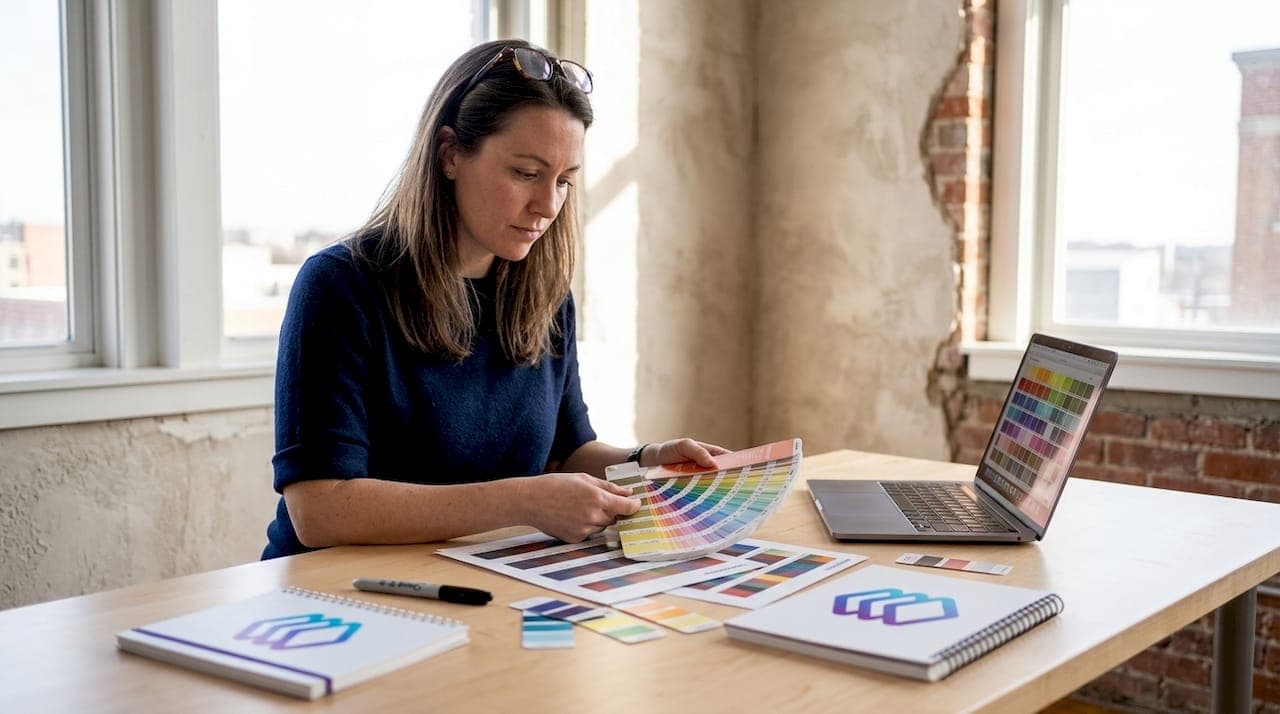
- Pantone color guides: Physical fan decks (coated and uncoated) are non-negotiable. Digital swatches on screen are not a reliable substitute.
- Calibrated monitor: Use a hardware calibration device to profile your display. Aim to recalibrate at least once a month.
- ICC color profiles: Load the correct output profile for your printer and substrate combination.
- Design software: Adobe Illustrator or CorelDRAW with Pantone libraries installed.
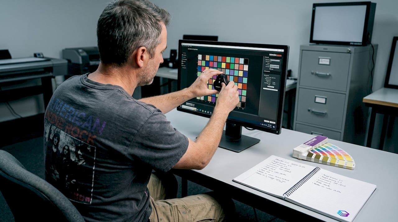
- Spectrophotometer (optional but recommended): Measures actual printed color values against the target.
Proper color profiles setup is a prerequisite for consistent Pantone results. Without the right ICC profile loaded, your software is essentially guessing how colors will translate to your output device.
| Tool | Function |
|---|---|
| Pantone fan deck | Physical color reference for client approvals |
| Monitor calibrator | Ensures on-screen color matches output targets |
| ICC profiles | Maps colors accurately between devices |
| Adobe Illustrator | Apply and manage Pantone swatches in design files |
| Spectrophotometer | Verifies printed color against Pantone standard |
| RIP software | Controls ink output for screen printing and DTF |
Your workspace lighting also matters. Use a D50 or D65 standard light source when evaluating color. Avoid evaluating prints under mixed lighting or near windows with variable natural light.
For your digital files, work in the correct color space from the start. Set your document to use spot colors rather than CMYK equivalents when specifying Pantone shades. Meeting print accuracy standards from the file setup stage prevents costly corrections later.
Pro Tip: Recalibrate your monitor after any significant change in ambient lighting or after moving equipment. A monitor that drifts even slightly can cause you to approve files that will print off-color. Calibration takes about 10 minutes and can save hours of reprints.
Step-by-step Pantone color matching workflow
Separating colors efficiently and following a systematic process increases color consistency and quality across every print job. Here is the workflow we recommend:
- Set up your document correctly. Open your design software and configure the document color mode to spot color. In Adobe Illustrator, go to File > Document Color Mode and select the appropriate setting for your output.
- Select and apply Pantone swatches. Use the Pantone library built into your software. Search by PMS code, not by visual appearance. Apply the swatch directly to your design elements.
- Verify swatch assignments. Open the Swatches panel and confirm every color in the file is assigned a named Pantone swatch, not a CMYK or RGB approximation.
- Prepare your file for separation. Export or save in a format that preserves spot color data, typically PDF or AI. Avoid flattening or rasterizing unless required by your output device.
- Run a test proof. Print a physical proof on the same substrate as the final job. Compare it directly against your Pantone fan deck under standard lighting.
- Approve or revise. If the proof matches, proceed. If not, adjust ink mixing or software settings and proof again before committing to a full run.
- Document the approved settings. Save your ink formulas, profiles, and file settings for repeat orders. This is how you build a reliable artwork print process over time.
Manual vs. automated color separation:
| Approach | Time required | Accuracy | Best for |
|---|---|---|---|
| Manual separation | High | Variable | Complex custom jobs |
| Automated (AI-assisted) | Low | 70-95% | High-volume, repeat work |
Pro Tip: Always share the PMS code, not a color sample image, with every stakeholder involved in a job. A code is exact. An image file can shift depending on the device it is viewed on.
Troubleshooting, verification, and common mistakes
Even with a solid workflow, color matching errors happen. Knowing how to catch and fix them quickly is what separates efficient shops from ones that lose money on reprints. File output standards make clear that even with best practices, errors in Pantone matching are common and can be caught with systematic checks.
The most common mistakes include:
- Wrong substrate: Printing on an uncoated stock when your Pantone reference is a coated swatch. Always match your fan deck type (C for coated, U for uncoated) to your actual substrate.
- Overlooked profiles: Using a generic printer profile instead of a substrate-specific ICC profile.
- Ignoring metamerism: Colors that match under one light source but differ under another. Always evaluate under consistent, standardized lighting.
- Skipping the test print: Approving color only on screen, without a physical proof on the actual substrate.
To verify output accuracy, use this checklist:
- Compare the printed sample to your physical Pantone fan deck, not to a screen.
- Use a spectrophotometer to measure the Delta E value. A Delta E below 2 is generally acceptable for most commercial work.
- Evaluate under both D50 standard light and your client's typical viewing environment.
- Check multiple areas of the print for consistency, especially on larger runs.
Industry data shows that color-related reprints account for a significant share of waste in commercial print shops. Some estimates place color errors among the top three causes of job failures in screen printing and apparel decoration.
If a mismatch persists after checking profiles and substrates, look at your ink mixing. Pantone inks have specific formulas. Using an expired or substituted base can throw off the final color even when everything else is correct. Keep your ink stock current and follow Pantone's mixing ratios precisely.
The real challenge with Pantone matching nobody talks about
Here is something most guides skip: the biggest source of Pantone color mismatch is not equipment or software. It is inconsistent human judgment applied at multiple points in the workflow.
An experienced operator approves a proof that looks close enough. A designer sends a file without verifying the swatch assignments. A shop owner skips the test print to save time on a rush job. These are not technical failures. They are process failures. And they happen in shops that own every piece of recommended equipment.
The rise of AI-assisted tools is starting to change this. Automated color separation and AI and color accuracy tools remove subjective decision points from the workflow. When software matches Pantone colors at 70-95% accuracy automatically, you reduce the number of moments where human inconsistency can creep in.
But technology alone is not the answer. What we consistently see is that shops with disciplined workflows outperform shops with better equipment but loose processes. Invest in your systems first. Then layer in automation to reinforce them. That combination is what actually produces reliable color, job after job.
Ready to master Pantone color matching?
You now have the foundation: the theory, the tools, the workflow, and the troubleshooting process. The next step is putting it into practice with the right support behind you.
LayerPrep is built specifically for print shops and graphic designers who need accurate, fast color matching without the manual overhead. Our AI-powered platform automatically separates colors, matches Pantone shades with up to 95% accuracy, and validates your files for DPI and bleed, all in an average of 30 seconds. Whether you are working with screen printing, DTF, or other methods, LayerPrep fits directly into your existing workflow. Upload your file, get print-ready layers fast, and spend less time fixing color errors. Start your first job today and see the difference a structured, automated process makes.
Frequently asked questions
What is the Pantone Matching System?
The Pantone Matching System is a standardized color reproduction system used to ensure consistency across print and production materials. It assigns unique codes to specific colors so every party in the production chain works from the same reference, as Pantone color standards confirm.
Do you need special equipment for Pantone color matching?
Yes, calibrated monitors, color profiles, and Pantone guides are essential for accurate matching. Proper color profiles and calibration are prerequisites for consistent Pantone results across different substrates and output devices.
What is the most common mistake when matching Pantone colors in print?
Ignoring substrate differences is the most common source of Pantone color mismatch. Using a coated Pantone reference for an uncoated stock, or vice versa, will produce visible color shifts even when everything else is correct, as outlined in file output standards.
How can you verify if a print matches the Pantone color accurately?
Use swatch books, test prints, and spectrometers to ensure color accuracy before final production. Measuring Delta E values with a spectrophotometer gives you an objective, numerical confirmation that your output meets the target, per print output standards.