
Miscommunication about printing terms costs designers and print shops thousands of dollars annually in reprints, delays, and frustrated clients. A single misunderstanding about DPI requirements or color profiles can turn a promising project into a costly disaster. This guide cuts through the jargon to deliver clear, practical explanations of essential graphic design printing terminology for 2026. You'll gain the knowledge to communicate confidently with print professionals, prepare files correctly the first time, and streamline your entire production workflow.
Table of Contents
- Understanding Fundamental Printing Terms
- Exploring Printing Methods And Their Specific Terms
- Mastering File Preparation And Validation Terms
- Optimizing Print Workflows With Key Terminology Knowledge
- How LayerPrep Helps You Master Printing Terms And Streamline Workflows
- FAQ
Key takeaways
| Point | Details |
|---|---|
| Core terminology mastery | Understanding DPI, bleed, and color profiles prevents costly print errors and ensures quality output. |
| Method-specific terms | Different printing techniques like screen printing and offset use unique terminology requiring tailored file preparation. |
| File validation essentials | Proper validation checks for resolution, color mode, and format eliminate production delays and waste. |
| Workflow optimization | Clear terminology knowledge improves communication between designers and print shops, reducing bottlenecks. |
Understanding fundamental printing terms
Every successful print project starts with mastering the language of print production. Understanding essential printing terms like DPI, bleed, and color profiles is critical for achieving high-quality print output. These foundational concepts form the backbone of professional print communication and directly impact your final results.
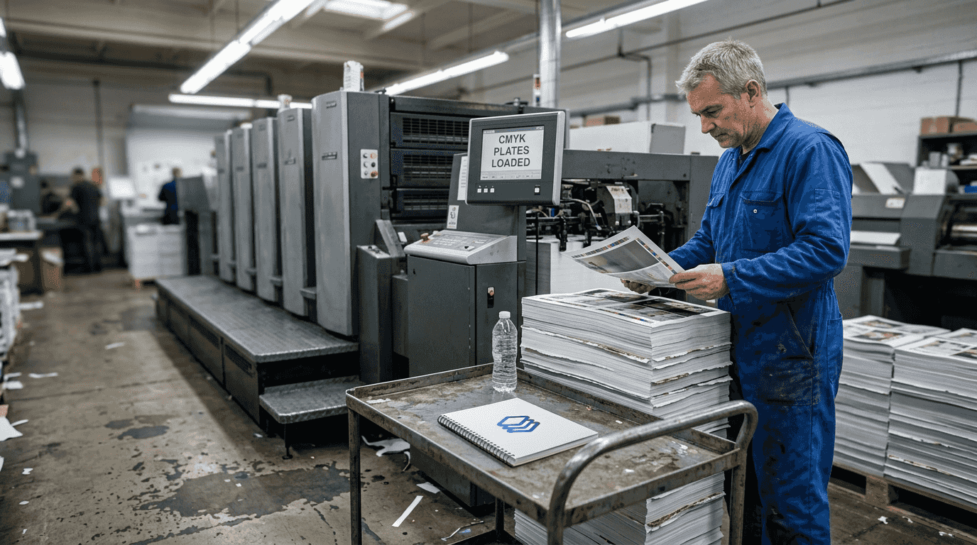
DPI, or dots per inch, measures the resolution density of printed images. Most professional printing requires 300 DPI for sharp, clear output, while lower resolutions produce pixelated, unprofessional results. Think of DPI as the building blocks of your image: more blocks create finer detail, fewer blocks create visible graininess. Always verify your printer's DPI requirements before finalizing any design.
Bleed refers to the extra image area extending beyond the final trim line, typically 0.125 inches on each edge. This safety margin ensures no white edges appear if the cutting process shifts slightly during trimming. Without proper bleed, your carefully designed piece can end up with unsightly white borders that scream amateur hour.
Color profiles determine how colors translate from screen to paper. RGB (Red, Green, Blue) works for screens, while CMYK (Cyan, Magenta, Yellow, Black) is the standard for printing. Converting your files to CMYK before printing prevents unexpected color shifts that can ruin your design's intended impact. The vibrant blues and greens you see on your monitor often appear duller in CMYK, so always preview your design in the correct color space.
Resolution and DPI work together but aren't identical. Resolution refers to the total pixel dimensions of your image (like 3000x2000 pixels), while DPI determines how those pixels spread across physical space. A high-resolution image at low DPI still prints poorly, just as a low-resolution image at high DPI can't magically add detail that doesn't exist.
Pro Tip: Always confirm the required DPI and bleed specifications with your print provider before finalizing files, as requirements vary by printing method and shop capabilities.
Key terms every designer should memorize:
- Trim line: The final edge where the printed piece gets cut
- Safe zone: The area inside the trim where critical text and graphics should stay
- Registration marks: Alignment guides ensuring color layers print in perfect position
- Overprint: When one color prints directly on top of another without knocking out the underlying color
Exploring printing methods and their specific terms
Print terminology shifts dramatically depending on which printing method you choose. Different printing methods use distinct terms and file preparations, making it essential to understand method-specific jargon before preparing your files.
Offset printing, the traditional workhorse of commercial printing, uses plates to transfer ink onto paper. You'll encounter terms like halftone (the pattern of dots creating the illusion of continuous tone), trapping (slight overlap between colors preventing white gaps), and color separation (dividing artwork into individual CMYK plates). Offset delivers exceptional quality for large runs but requires significant setup time and cost.
Digital printing bypasses plates entirely, printing directly from digital files like a massive desktop printer. This method uses terms like raster image processor (RIP, the software converting files to printable format) and variable data printing (customizing each printed piece with different information). Digital printing excels at short runs and quick turnarounds but may show slight quality differences compared to offset.
Screen printing forces ink through a mesh screen onto the substrate, popular for textiles and promotional items. Key terms include mesh count (the fineness of the screen affecting detail level), squeegee (the tool pushing ink through the mesh), and underbase (a white layer printed first on dark fabrics). Each color requires a separate screen, making complex designs more expensive and time-consuming.
Flexography uses flexible rubber or polymer plates, common for packaging and labels. You'll hear about anilox roller (transferring precise ink amounts), plate mounting (attaching flexible plates to cylinders), and dot gain (ink spreading that requires compensation in file preparation). Flexography works brilliantly on various materials but requires specialized knowledge for optimal results.
| Printing Method | Ideal Uses | Key Terms | Typical Run Size |
|---|---|---|---|
| Offset | Magazines, brochures, large runs | Halftone, trapping, color separation | 1,000+ pieces |
| Digital | Short runs, variable data | RIP, on-demand printing | 1-1,000 pieces |
| Screen | Apparel, posters, promotional items | Mesh count, underbase, squeegee | 50-5,000 pieces |
| Flexography | Packaging, labels, flexible materials | Anilox roller, plate mounting, dot gain | 10,000+ pieces |
Pro Tip: Choosing the printing method early guides correct file preparation and terminology usage, preventing costly revisions when you discover your files don't match the production process.
Each method demands specific file considerations:
- Offset requires CMYK with proper trapping and overprint settings
- Digital accepts RGB or CMYK but benefits from embedded color profiles
- Screen printing needs separated spot colors with appropriate halftone settings
- Flexography demands compensation for dot gain and plate distortion
Mastering file preparation and validation terms
Preparing print-ready files involves more than just creating attractive designs. Proper file preparation and print validation are key to flawless print production and dramatically reduce delays and material waste.
Print readiness means your file contains all necessary elements in the correct format, resolution, and color space for successful printing without additional adjustments. A print-ready file includes proper bleeds, correct color profiles, embedded fonts, flattened transparencies, and appropriate resolution. Missing any element creates production delays while the print shop contacts you for corrections.
Print validation involves systematically checking files against technical requirements before sending to production. This process catches errors like low resolution images, missing fonts, incorrect color modes, and inadequate bleeds. Many designers skip validation, discovering problems only after expensive printing begins.
Follow these steps to validate files before printing:
- Check resolution meets minimum requirements (typically 300 DPI for most printing)
- Verify color mode matches printing method (CMYK for most commercial printing)
- Confirm bleeds extend properly beyond trim lines (usually 0.125 inches)
- Ensure all fonts are embedded or converted to outlines
- Flatten transparencies to prevent unexpected rendering issues
- Review file format matches printer specifications (PDF/X-1a is common standard)
- Examine trim marks, registration marks, and color bars are present if required
| File Format | Advantages | Disadvantages | Typical Uses |
|---|---|---|---|
| PDF/X-1a | Industry standard, reliable output | Limited editability after creation | Final print files, professional printing |
| PDF/X-4 | Supports transparency, layers | Requires compatible RIP software | Advanced designs with transparency |
| TIFF | Lossless quality, widely supported | Large file sizes | High-quality images, archival |
| EPS | Vector format, scalable | Outdated for modern workflows | Legacy systems, simple graphics |
| AI | Native Illustrator, fully editable | Requires Adobe software | Design files, pre-press preparation |
Layers in design files serve different purposes during printing. Keeping text, images, and graphics on separate layers facilitates last-minute edits and color adjustments. However, many printers prefer flattened files to avoid unexpected rendering issues. Always clarify whether your printer wants layered or flattened files.
Trimming marks indicate exactly where the printed sheet gets cut to final size. These small lines outside the design area guide cutting equipment for precise results. Color bars and registration marks help press operators ensure accurate color reproduction and perfect alignment across multiple color passes.
Safe zones protect critical content from accidental trimming. Keep important text and graphics at least 0.125 inches inside the trim line, as cutting tolerances can vary slightly. Nothing frustrates clients more than seeing their phone number partially cut off because it sat too close to the edge.
Common file preparation mistakes include:
- Using RGB color mode instead of CMYK for print projects
- Forgetting to outline or embed fonts, causing text to reflow incorrectly
- Setting insufficient resolution, resulting in pixelated output
- Omitting bleeds, creating white edges on trimmed pieces
- Leaving transparency effects unflattened, causing rendering problems
Optimizing print workflows with key terminology knowledge
Mastering printing terminology transforms from academic exercise to practical advantage when you apply this knowledge to real production workflows. Knowledge of print design terms enables smoother workflow coordination and eliminates the costly miscommunications that plague design-to-print handoffs.
Clear terminology creates a shared language between designers, clients, and print shops. When you confidently discuss trapping requirements, color separation needs, or substrate choices, print professionals take you seriously and provide better service. Vague requests like "make it look good" or "just print it" signal amateur status and often result in suboptimal outcomes.
Workflow bottlenecks frequently stem from terminology confusion. A designer submits RGB files assuming the printer will convert them, but the shop's automated workflow rejects non-CMYK files. The project sits in limbo while emails fly back and forth clarifying requirements. A production manager requests "printer spreads" but receives "reader spreads," delaying the entire job. These scenarios repeat daily in print shops worldwide, wasting time and money.
Incorporating correct terminology into design briefs prevents misunderstandings before they start. Specify "300 DPI CMYK with 0.125-inch bleed" rather than "high quality color." Request "saddle-stitched binding" instead of "stapled in the middle." Precise language eliminates guesswork and ensures everyone shares the same expectations.
File naming conventions benefit from terminology knowledge too. Names like "ClientName_Brochure_CMYK_300dpi_bleed.pdf" instantly communicate file specifications, while "final_FINAL_v3_revised.pdf" creates confusion. Systematic naming saves time when managing multiple versions and variations.
Best practices for designer-printer collaboration:
- Establish terminology standards in initial project discussions
- Request printer specifications before beginning design work
- Use preflight checks to validate files against printer requirements
- Maintain open communication channels for technical questions
- Document any special requirements or non-standard specifications
- Schedule press checks for critical color-matching projects
Pro Tip: Standardize terminology within your team or business to avoid errors and speed production, creating internal style guides that define how you'll use printing terms consistently.
Building relationships with print professionals accelerates your learning curve. Ask questions about their processes, equipment capabilities, and preferred file specifications. Most print shop staff love discussing their craft and appreciate designers who want to understand the technical side. This knowledge helps you design within production constraints rather than creating beautiful impossibilities.
The investment in terminology mastery pays dividends throughout your career. Projects move faster, revisions decrease, and print quality improves. Clients trust your expertise when you speak confidently about printing requirements. Print shops prioritize your jobs because your files arrive correctly prepared. These cumulative advantages separate professional designers from hobbyists.
How LayerPrep helps you master printing terms and streamline workflows
Navigating the complex world of printing terminology becomes significantly easier with the right tools supporting your workflow. LayerPrep combines AI-powered automation with built-in validation to ensure your files meet professional printing standards every time.
LayerPrep automatically validates DPI resolution, checks bleed specifications, and separates colors with 70-95% Pantone matching accuracy. The platform accepts PNG, JPG, PDF, and SVG files up to 50MB, handling complex gradients and AI-generated designs with equal ease. Within an average of 30 seconds, you receive print-ready layers optimized for screen printing, DTF, and other production methods. This automated approach eliminates the manual tedium of file preparation while teaching you proper specifications through consistent, reliable output. Whether you're preparing files for client approval or final production, LayerPrep ensures your designs meet professional standards without requiring you to become a prepress expert overnight.
FAQ
What are the most important printing terms to learn first?
Start with DPI, bleed, color profiles (CMYK vs RGB), resolution, and print readiness as your foundation. These terms appear in virtually every print project and directly impact output quality. Understanding them prevents the most common and costly printing errors. Master these basics before diving into method-specific terminology.
How do color profiles affect printed design outcomes?
Color profiles like CMYK ensure colors print as intended by converting from screen RGB values to ink combinations. Without proper profiles, vibrant screen colors often appear dull or shift unexpectedly on paper. Always work in CMYK for print projects to preview accurate color representation. Embedded color profiles help maintain consistency across different devices and printers.
What common mistakes should be avoided when preparing print files?
Common file preparation errors include incorrect DPI, missing bleeds, improper file formats, and unflattened transparencies. Failing to check these elements leads to poor-quality prints, white edges on trimmed pieces, and production delays. Using RGB instead of CMYK causes unexpected color shifts. Not validating files before printing risks discovering errors only after expensive production begins.
How does understanding printing methods improve file preparation?
Each printing method requires specific file configurations and terminology knowledge. Offset printing needs proper trapping and color separation, while screen printing demands separated spot colors. Digital printing accepts different color modes than flexography. Knowing your printing method before designing allows you to prepare files correctly from the start, avoiding costly revisions and production delays.
Why do print shops emphasize proper bleeds and safe zones?
Cutting equipment has slight tolerance variations, meaning trim lines can shift by fractions of an inch. Bleeds prevent white edges if cutting drifts outward, while safe zones protect content if cutting drifts inward. These specifications account for real-world manufacturing variability. Professional print shops emphasize these requirements because they've seen countless projects ruined by inadequate bleeds or content placed too close to trim lines.