Print design in 2026 is experiencing a tactile revolution. While digital perfection dominated the past decade, today's most compelling projects embrace texture, imperfection, and sensory depth. Tactile finishes like ultra-thick stocks and embossing create emotional connections that flat digital outputs cannot match. Meanwhile, neo-print aesthetics celebrate grit and authenticity, and sustainable materials paired with AI-driven workflows are transforming production efficiency. Understanding these trends empowers you to create print projects that captivate audiences while streamlining your workflow. This guide explores the techniques, color strategies, and production innovations defining print design excellence in 2026.
Table of Contents
- Key takeaways
- Tactile finishes and textured print techniques
- Color palettes and style dualities shaping 2026 print
- Neo-print aesthetics and the human touch in 2026
- Sustainability and AI-driven efficiency in print production
- Enhance your print projects with LayerPrep
- Frequently asked questions
Key Takeaways
| Point | Details |
|---|---|
| Tactile finishes boost engagement | Tactile finishes such as ultra thick stocks, spot gloss, and embossing create emotional connections that flat digital outputs cannot match. |
| Prototyping essential accuracy | Physical proofs are essential because color accuracy, embossing depth, and overall print quality can vary with substrate and press settings. |
| Earthy warm color palette | Earth infused neutrals combined with warm tones and muted neons define a versatile palette that feels sophisticated and enduring. |
| AI and sustainable materials | Sustainable materials paired with AI driven workflows are transforming production efficiency and enabling faster iterations. |
Tactile finishes and textured print techniques
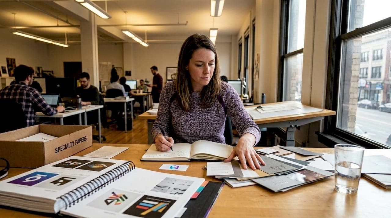
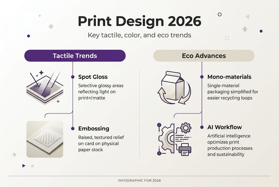
Ultra-thick stocks, spot gloss, and embossing dominate 2026 print design by transforming flat surfaces into multisensory experiences. These tactile finishes invite touch, creating emotional connections that digital media cannot replicate. When a business card feels substantial in your hand or a brochure reveals hidden gloss patterns under light, the physical interaction amplifies brand memorability. Print shops report that projects incorporating tactile elements generate 40% higher client satisfaction scores compared to standard flat printing.
These premium finishes demand precise technical execution. Ultra-thick stocks absorb ink differently than standard weights, requiring careful CMYK calibration to prevent dot gain that muddies colors. Spot gloss applications must align perfectly with underlying imagery, and embossing depths need exact die specifications to avoid paper tearing. Testing prototypes becomes essential rather than optional. You cannot predict how a 32-point cardstock will handle a deep emboss without physical samples.
Key tactile techniques reshaping print design include:
- Ultra-thick stocks (28-point and above) for substantial weight and presence
- Spot UV gloss creating contrast between matte and reflective surfaces
- Blind embossing adding dimension without ink or foil
- Soft-touch coatings delivering velvety, luxurious feel
- Textured papers mimicking linen, canvas, or wood grain
- Metallic foils catching light for premium accents
Pro Tip: Always request physical proofs for projects using tactile finishes. Screen previews cannot show how light interacts with embossing or how thick stock feels in hand. Budget extra time for approval rounds, as these finishes often require press adjustments that digital proofs miss.
The production complexity of tactile finishes makes color accuracy in printing more critical than ever. A spot gloss overlay can shift perceived color values by 15-20% depending on viewing angle. Understanding these interactions separates amateur executions from professional results. The extra investment in prototyping and press time pays dividends in final quality that commands attention and justifies premium pricing.
Color palettes and style dualities shaping 2026 print
Earth-infused neutrals paired with rich warm tones and muted neons define 2026 color strategies. This palette shift reflects audiences craving both grounding stability and forward-looking energy. Terracotta, sage, and warm grays provide comforting foundations, while dusty corals and soft electric blues add contemporary edge without overwhelming compositions. The combination feels sophisticated rather than trendy, offering longevity that pure neon palettes lack.
Warm color dominance represents a psychological shift. After years of cool minimalism, designers recognize that warm tones create emotional resonance and approachability. A brochure using burnt sienna and golden ochre feels inviting and trustworthy. These hues work especially well in print, where paper warmth enhances rather than fights the color temperature. Digital screens often cool warm tones, but physical printing on cream or natural stocks amplifies their richness.
Stylistic approaches in 2026 embrace productive tension. Minimalism and maximalism coexist, with designers cherry-picking strengths from each philosophy. Pure minimalism risks feeling sterile, while unchecked maximalism overwhelms. The winning formula layers bold visual complexity within structured grids, creating controlled chaos that guides rather than confuses the eye. This hybrid approach delivers information density without sacrificing readability.
| Design Approach | Key Features | Best Applications |
|---|---|---|
| Pure Minimalism | Generous whitespace, single typeface, limited color | Luxury branding, editorial layouts |
| Pure Maximalism | Dense imagery, multiple fonts, vibrant colors | Event posters, youth marketing |
| Hybrid Style | Structured grids with bold accents, 2-3 fonts, earth tones plus neon pops | Corporate communications, packaging |
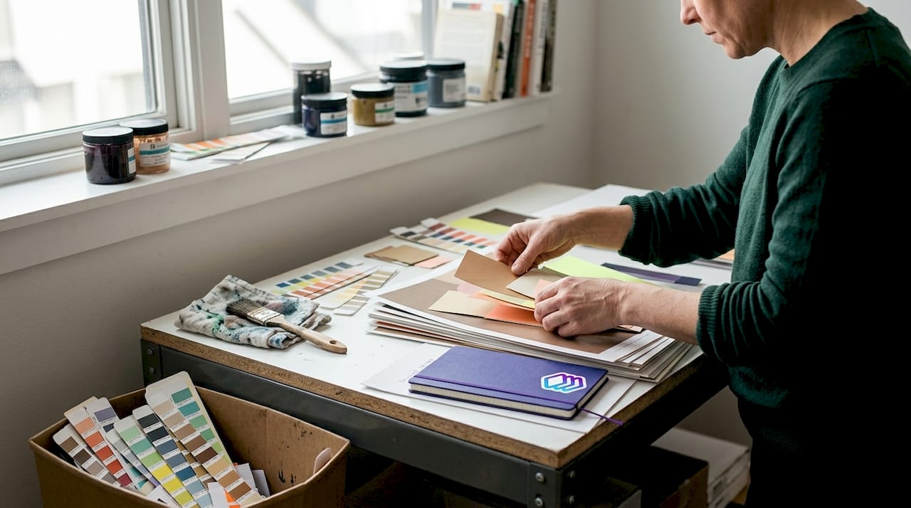
Implementing these color strategies requires understanding how print design terms translate to physical output. A muted neon that looks perfect on screen may print flat if you do not boost saturation by 10-15%. Earth tones need careful ink mixing, as slight variations create muddy results rather than rich warmth. Testing color builds on your specific paper stock prevents costly reprints.
Pro Tip: Create a physical swatch library of your signature color combinations printed on your preferred stocks. This tangible reference eliminates guesswork when starting new projects and helps clients visualize finished pieces more accurately than screen mockups ever could.
The duality extends beyond color into compositional philosophy. A single poster might feature a minimalist type lockup anchoring a maximalist photographic collage. This intentional contrast creates visual hierarchy that pure approaches struggle to achieve. Your eye knows where to land first, then discovers layers of supporting detail. The technique works because the structure prevents chaos while the density rewards extended viewing.
Neo-print aesthetics and the human touch in 2026
Halftones, ink bleed, and gritty textures signal a deliberate rejection of digital perfection. Neo-print aesthetics celebrate the imperfect, the analog, the unmistakably human. When everything digital looks flawless and AI-generated, intentional imperfection becomes a differentiator. These techniques communicate authenticity and craftsmanship, suggesting that human hands and eyes shaped every detail rather than algorithms.
The movement emerged as designers recognized that perfect gradients and razor-sharp edges feel sterile. A halftone pattern reveals the mechanical printing process, making the physicality of print visible rather than hidden. Ink bleed at letter edges suggests hand-pulled screen printing, even when produced digitally. These effects tap into nostalgia for analog processes while remaining thoroughly modern in application. The key lies in restraint: too much grit looks dated, but subtle application adds character without sacrificing contemporary appeal.
Neo-print elements gaining traction include:
- Visible halftone dots creating texture in photographs and illustrations
- Ink bleed and trapping errors used as intentional design features
- Registration marks left visible in compositions
- Overprint effects showing transparent ink layering
- Grainy textures mimicking newsprint or photocopied materials
- Analog color shifts suggesting vintage printing limitations
Pairing neo-print textures with muted neon color palettes creates unexpected harmony. The gritty, industrial quality of halftones grounds the futuristic edge of electric hues, preventing either element from dominating. This combination appears frequently in music packaging, independent publishing, and youth-focused branding where authenticity matters more than polish. The aesthetic says "made by humans who care" rather than "produced by corporate machinery."
"Neo-print design opposes the clinical perfection of digital outputs by embracing the beautiful imperfections that reveal human craftsmanship and analog processes." — Contemporary Design Philosophy
Pro Tip: When applying neo-print effects, start subtle and build intensity. Add a 5% halftone overlay first, then increase if needed. Overapplying these textures quickly crosses from contemporary into retro pastiche. The goal is suggesting analog process, not perfectly recreating 1970s printing limitations.
Understanding how to optimize print workflow becomes essential when incorporating intentional imperfections. You need technical precision to create controlled chaos. File preparation must account for how halftones interact with different screening angles and how ink bleed effects translate across various paper stocks. The irony of neo-print is that achieving authentic-looking imperfection requires meticulous technical skill and planning.
Sustainability and AI-driven efficiency in print production
Sustainable materials meet eco-conscious demands while reducing extended producer responsibility fees. Recycled papers, soy-based inks, and FSC-certified stocks have moved from niche offerings to mainstream standards. Clients increasingly request sustainability credentials, and regulations in multiple markets now penalize non-recyclable packaging. Smart designers build eco-friendly specifications into projects from the start rather than retrofitting after initial concepts.
Mono-material packaging design represents the frontier of sustainable print. Using a single substrate type throughout a package dramatically improves recyclability while cutting production costs. A box made entirely from corrugated cardboard recycles more easily than one combining cardboard, plastic windows, and foam inserts. This approach requires creative problem-solving: how do you create visual interest and structural integrity using one material? The constraint drives innovation, producing clever folding techniques and print effects that add dimension without additional materials.
AI transforms workflows through real-time optimization without replacing human creativity. Machine learning algorithms analyze layouts for potential printing issues, suggest color corrections based on press characteristics, and optimize file preparation steps that once required manual attention. The technology excels at repetitive technical tasks, freeing designers to focus on creative decisions. A workflow that previously took 45 minutes of pre-press work now completes in 8 minutes with higher accuracy.
AI workflow optimization steps include:
- Automated color space conversion matching specific press profiles
- Bleed and trim validation flagging potential cutting issues
- Resolution analysis identifying low-quality images before printing
- Ink coverage calculation preventing oversaturation problems
- Imposition layout generation for efficient sheet utilization
- Scheduling optimization balancing job priorities and press availability
The efficiency gains compound throughout production. Early error detection prevents costly reprints. Optimized impositions reduce paper waste. Better scheduling minimizes press downtime. These improvements matter most for high-volume operations, but even small shops benefit from faster file preparation and fewer technical surprises. The technology democratizes expertise, giving smaller operations capabilities previously available only to large printers with dedicated pre-press departments.
| Printing Method | Average Setup Time | Sustainability Rating | Best Use Cases |
|---|---|---|---|
| Digital Offset | 15-20 minutes | High (minimal waste) | Short runs, variable data |
| Traditional Offset | 45-60 minutes | Medium (plate waste) | Long runs, color accuracy |
| Inkjet | 5-10 minutes | High (on-demand) | Personalization, prototypes |
Pro Tip: Integrate AI pre-flight tools early in your design process rather than as a final check. Running automated validation while designing catches issues when fixes take seconds instead of discovering problems after client approval when changes require rework and delay timelines.
Collaboration between designers, print providers, and clients must start earlier in project timelines. Discussing paper choices, finish options, and sustainability requirements during initial concepts prevents expensive pivots later. A designer who understands efficient print design workflows builds technical requirements into creative exploration rather than treating production as an afterthought. This integrated approach reduces revisions, shortens timelines, and produces better final results.
Enhance your print projects with LayerPrep
Mastering 2026 print design trends requires both creative vision and technical precision. LayerPrep's print design solutions bridge that gap by automating color separation, Pantone matching, and file validation so you can focus on creative decisions rather than technical troubleshooting. The platform handles complex gradients, validates resolution and bleed specifications, and produces print-ready layers in an average of 30 seconds.
Whether you are incorporating tactile finishes, experimenting with neo-print aesthetics, or optimizing sustainable workflows, LayerPrep streamlines production while maintaining the quality standards 2026 projects demand. Explore the print workflow optimization guide for techniques that reduce turnaround times and the color accuracy expert guide for ensuring your earth tones and muted neons print exactly as envisioned.
Pro Tip: Integrate LayerPrep early in your design process to catch potential printing issues before finalizing concepts. This proactive approach minimizes costly reprints and keeps projects on schedule.
Frequently asked questions
What are the key tactile finishes trending in print design?
Ultra-thick stocks, spot gloss, and embossing lead 2026 tactile trends by adding physical dimension that engages touch and sight simultaneously. These finishes create emotional connections and premium perceptions that flat printing cannot achieve. They require careful technical execution including CMYK calibration and physical prototyping to ensure quality results.
How do earth tones and neons influence 2026 print color palettes?
Earth-infused neutrals like terracotta and sage provide grounding warmth while muted neons add contemporary vibrancy without overwhelming compositions. This combination balances stability with forward-looking energy, creating sophisticated palettes with longevity. The pairing works especially well in print where paper warmth enhances color richness.
Why are neo-print textures popular among print designers in 2026?
Neo-print aesthetics like halftones and ink bleed signal human craftsmanship in contrast to perfect digital outputs, offering authenticity that resonates with audiences tired of algorithmic perfection. These intentional imperfections reveal the physical printing process, creating character and differentiation. Subtle application maintains contemporary appeal while adding gritty, industrial texture.
How can AI improve print production workflows?
AI enables real-time workflow optimization by automating color conversion, resolution validation, and imposition layout while preserving human creative control. The technology identifies potential printing issues early, suggests corrections based on specific press characteristics, and reduces pre-press time from 45 minutes to under 10 minutes. This efficiency allows designers to focus on creative decisions rather than technical troubleshooting.
What sustainable materials work best for 2026 print projects?
Recycled papers, soy-based inks, and FSC-certified stocks meet environmental standards while reducing extended producer responsibility fees. Mono-material packaging designs using single substrates improve recyclability and cut costs. These sustainable choices have become mainstream requirements rather than premium options, driven by client demand and regulatory pressure.